Tools
My role
Led end-to-end UX design, including user research, ideation, wireframing, prototyping, and testing.
The team
Collaborated with a cross-functional team including product managers, mobile engineers (iOS/Android), QA, and front-/back-end developers.


Note: Due to NDA restrictions, I’m unable to share detailed visuals or all deliverables from this project. However, the following sections outline my process, approach, and key takeaways.
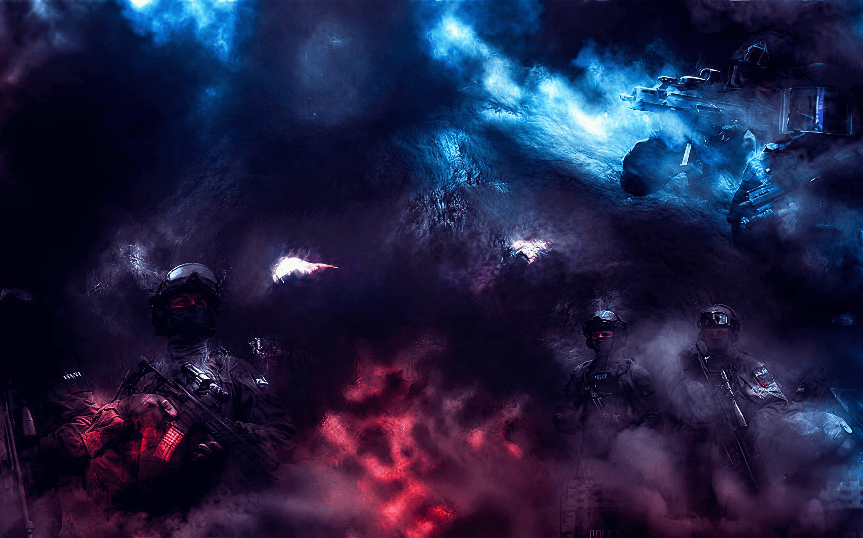
The client operates in the eSports industry, and this project was designed to offer users exclusive access to competitive gaming content.
My goal was to curate familiar UX patterns from leading content platforms and empower streamers by simplifying the broadcasting experience. The result: a tool that allows teams to easily invite and manage viewers for exclusive live streams.
OVERVIEW
DESIGN PROCESS
Research & Ideate
Wireframes
Testing
Solution
Figma
High-Fidelity Wireframes
Results
Research & Ideate
Testing
Wireframes
Solution
How do you make a digital crowd feel like the best parts of being in a physical one?
Live streaming creates a one-way relationship powerful, but often isolating. I explored how to make this more inclusive, especially for users who can’t attend in person.
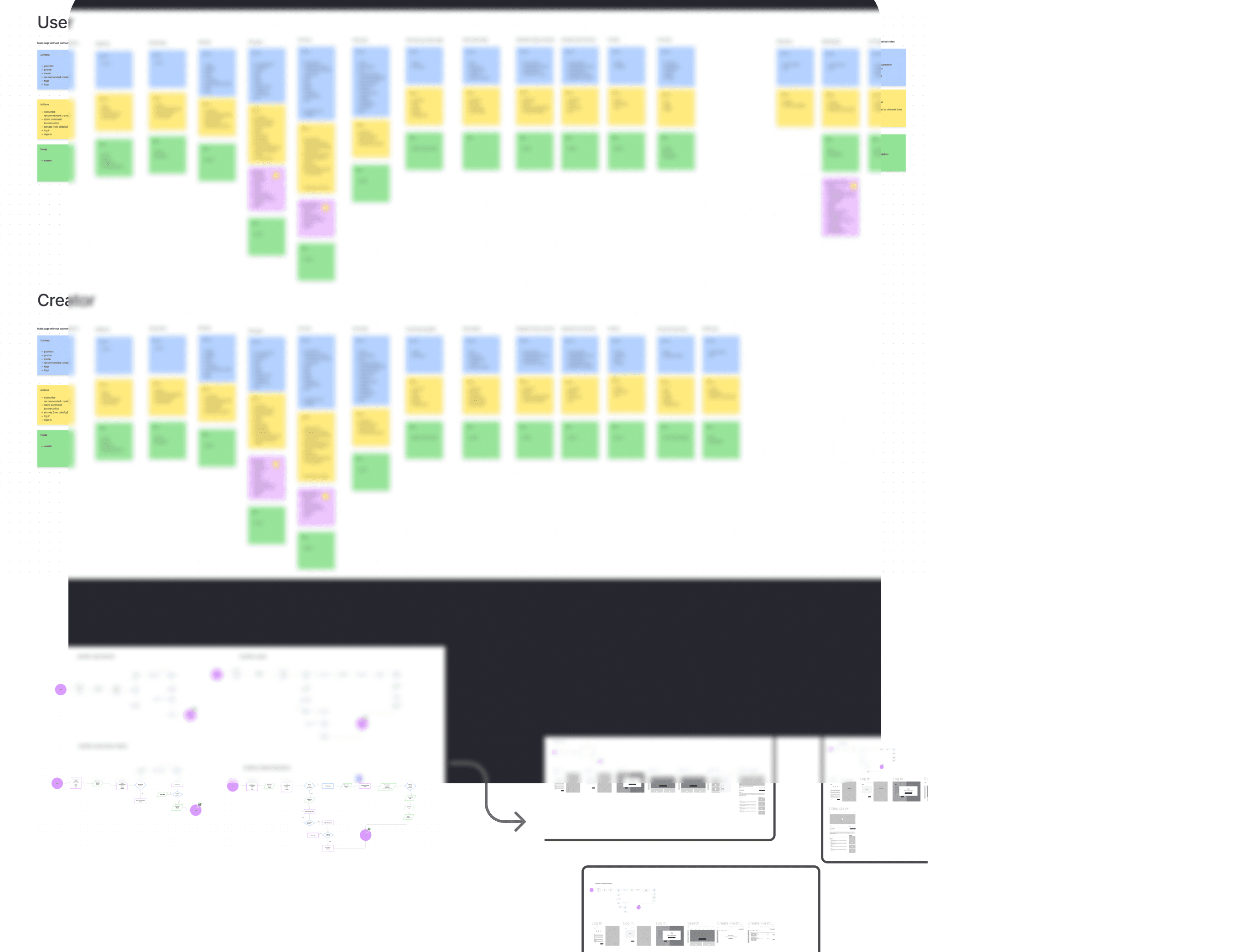
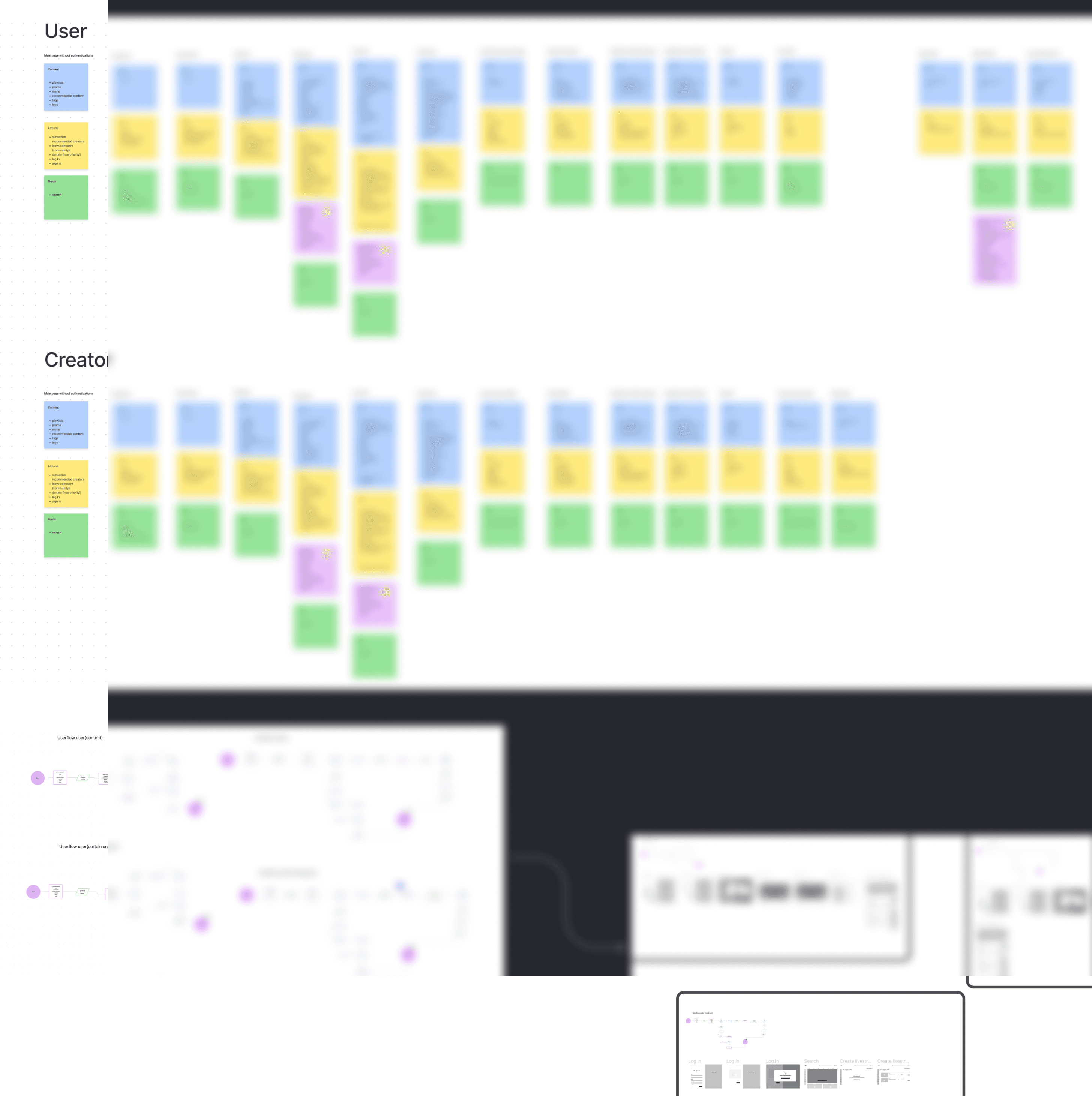
Through research and competitive analysis, I built a user journey map to identify key pain points. This helped me prioritize what to solve and where to focus my next design steps.
Based on the insights from the user journey map, I created the information architecture and key user flows for both the user and creator sides of the platform.
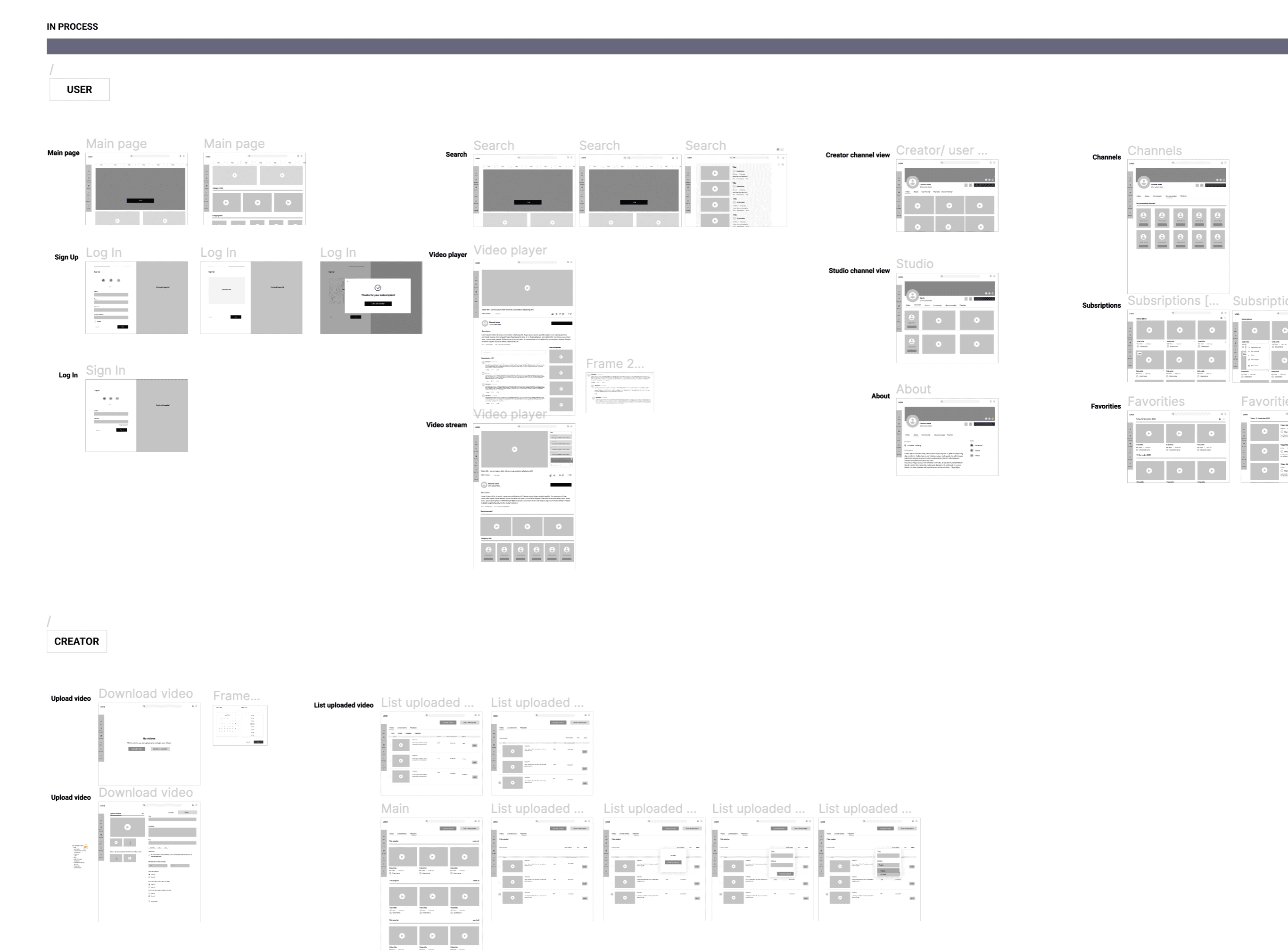
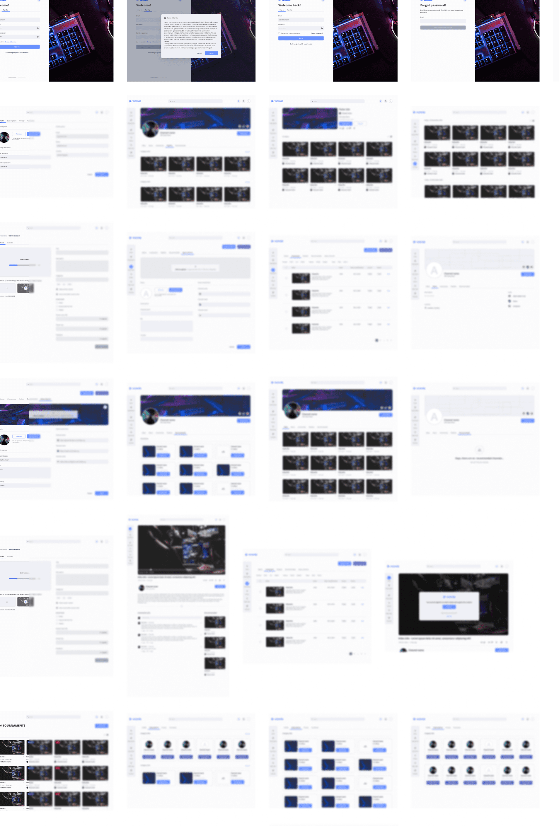
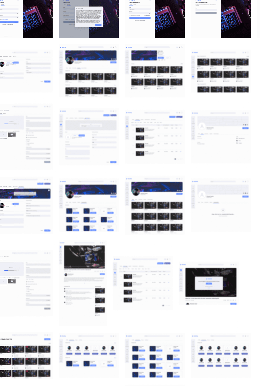
With a clear direction from research and journey mapping, I created the initial wireframes focused on usability and simplicity.
The goal was to ensure that the product felt intuitive from the first interaction reducing barriers, eliminating confusion, and guiding users through key tasks with ease.
The initial results yielded some problems with our product. Though we were aware our solution wasn't fully refined, It was great to get specific data on the usability potential problems from a target audience firsthand. It's one thing to design based on your team's perspective, but it's another thing to design from a user-specific point of view that only has the information you give them and their own biases.
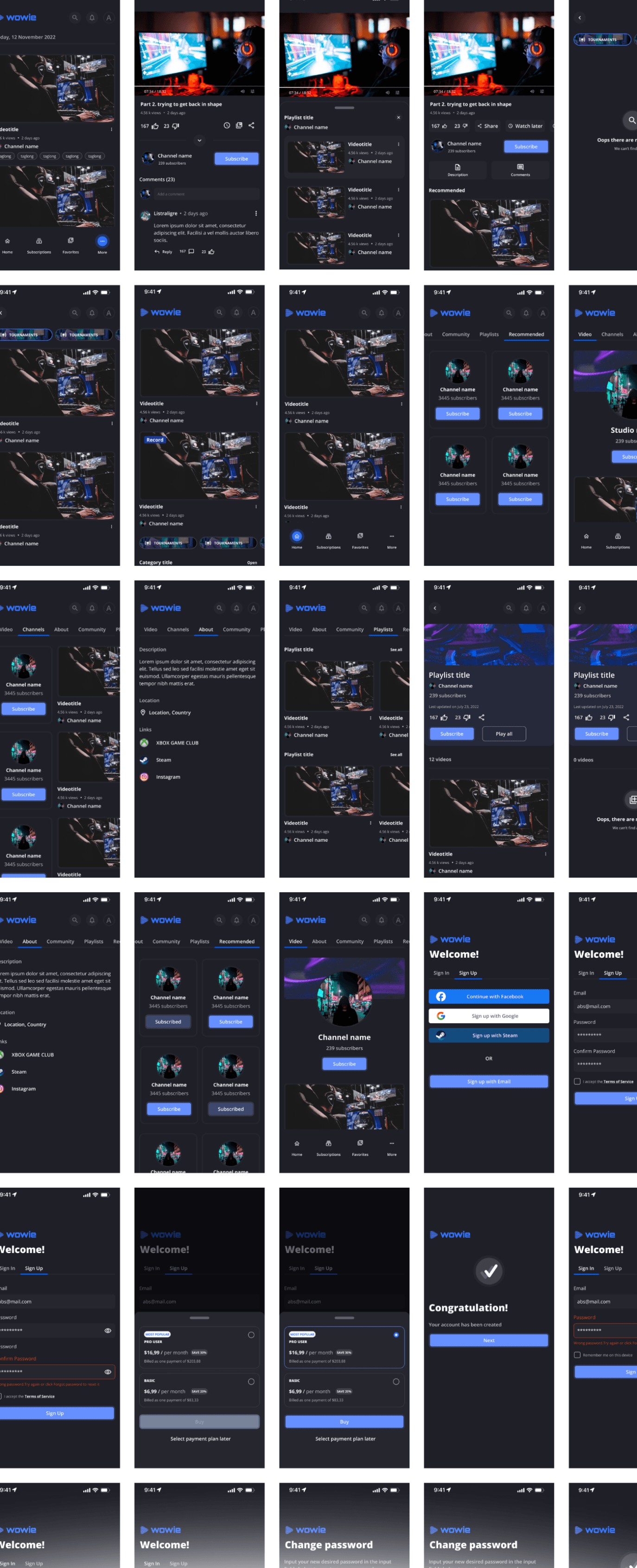
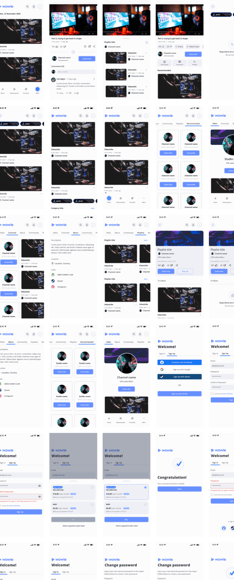
After gathering insights from research and user testing, I moved into high-fidelity design. This stage focused on creating a cohesive system that would scale across both desktop and mobile.
I developed:
A design system including typography, color, and component libraries
A style guide to maintain consistency across platforms
A high-fidelity interactive prototype used in usability testing
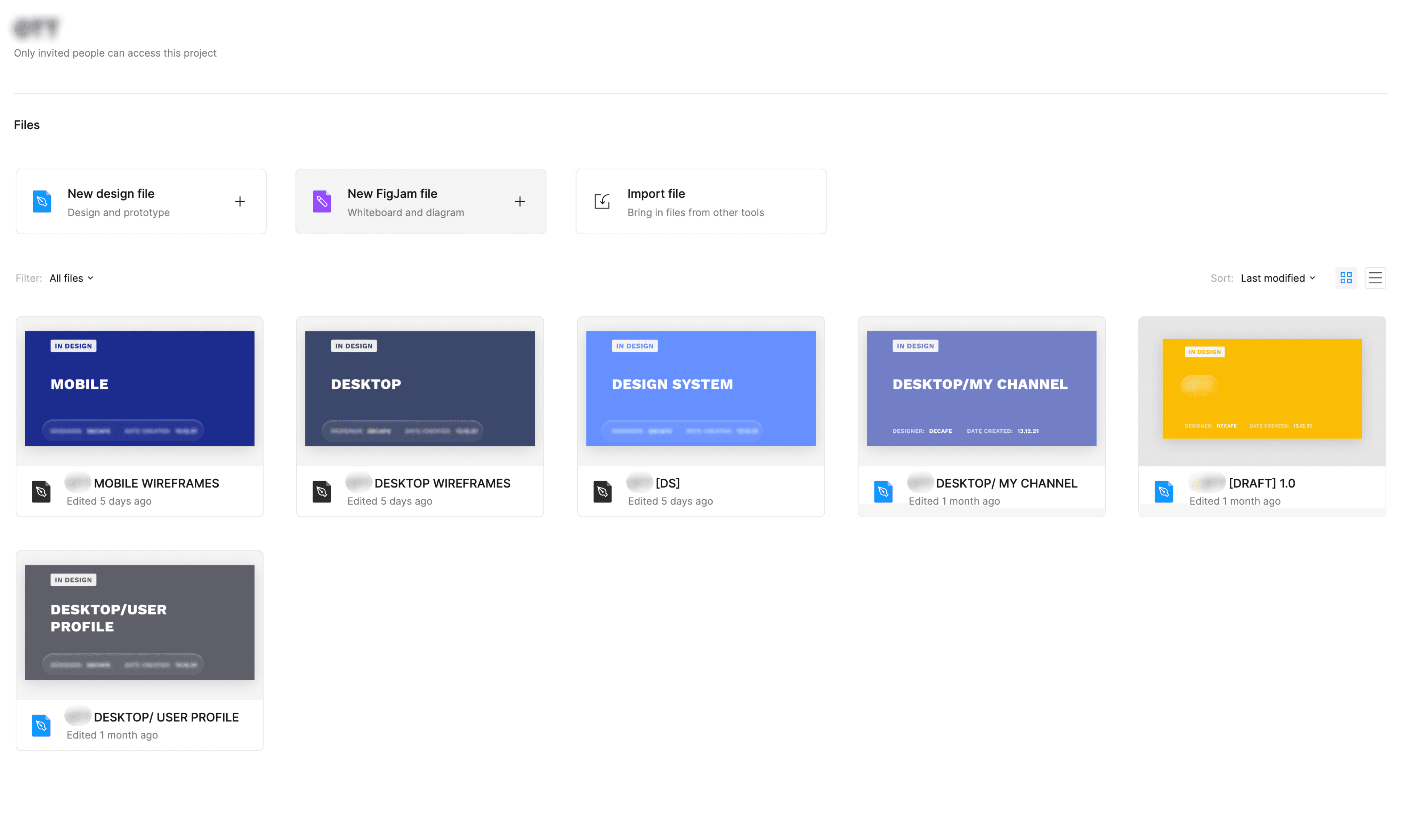
A centralized file structure for desktop, mobile, and user profile flows all housed in one organized Figma project
This structured approach allowed for faster iteration, clearer collaboration with developers, and better documentation for handoff.
All files were structured consistently to support both design clarity and developer collaboration. This included:
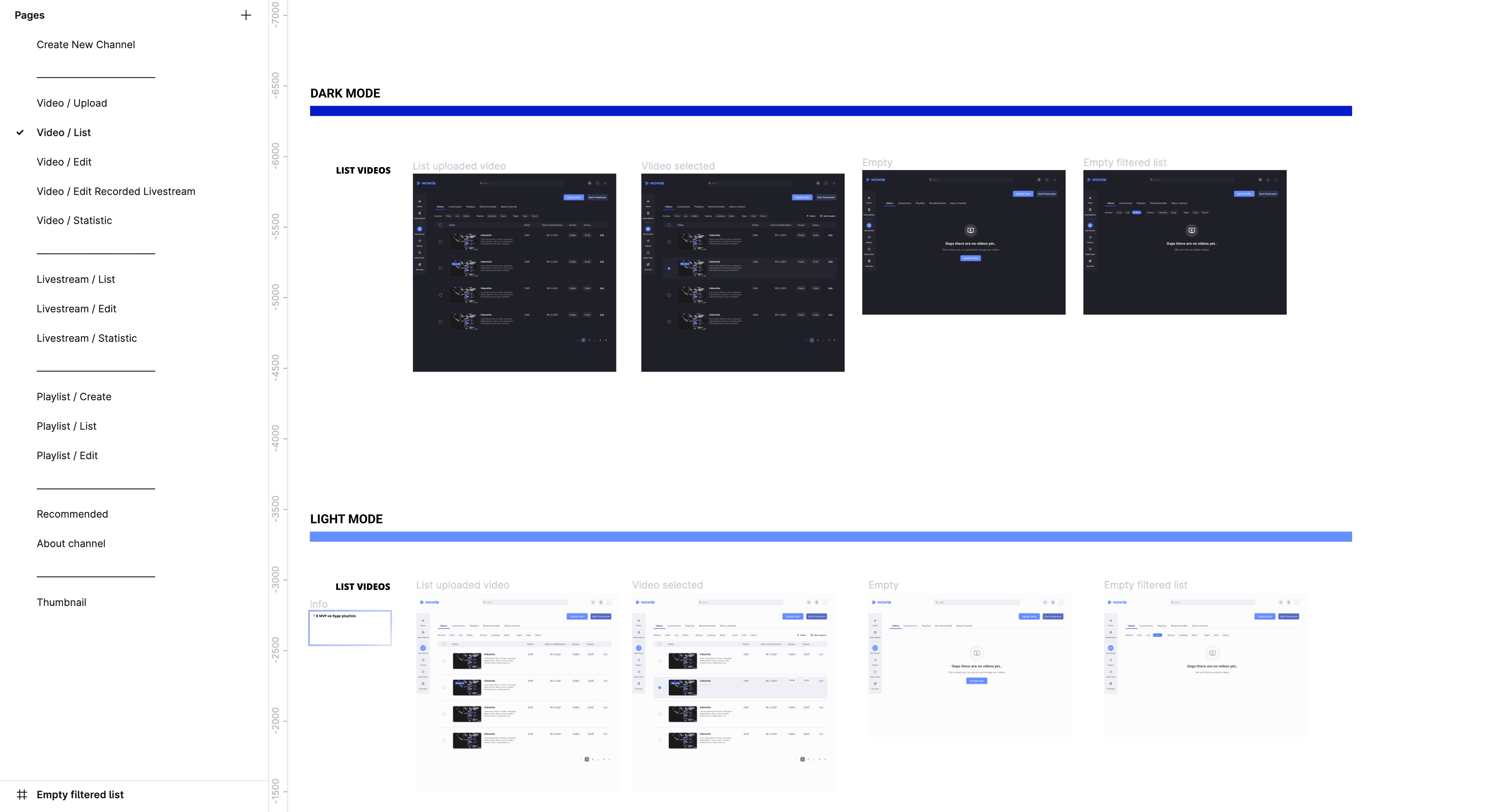
Separate layouts for dark and light modes
Clear page-level flows (e.g., upload, edit, playlist management, channel settings)
Dedicated files for desktop and mobile wireframes
A library of modular components reused across multiple views


This level of organization was especially important because the developers were working with Figma for the first time. A clean, intuitive file structure helped minimize confusion, reduced onboarding time, and ensured smoother handoff, ultimately streamlining both the design and development processes while maintaining visual consistency across the product.
All design files followed a consistent organizational pattern, with clearly separated pages. This structure made it easy for both the design and development teams to find, reference, and collaborate on specific flows.
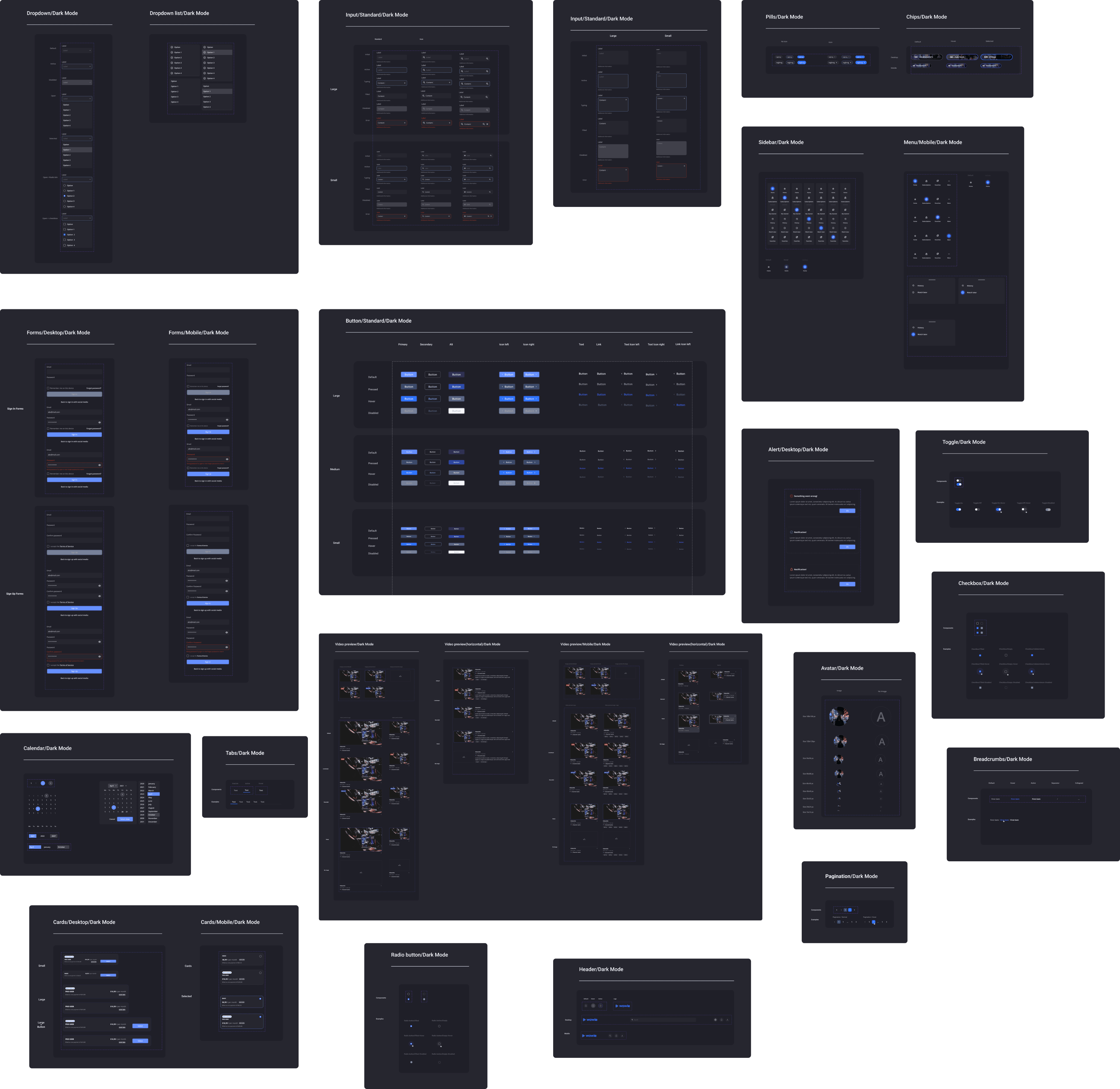
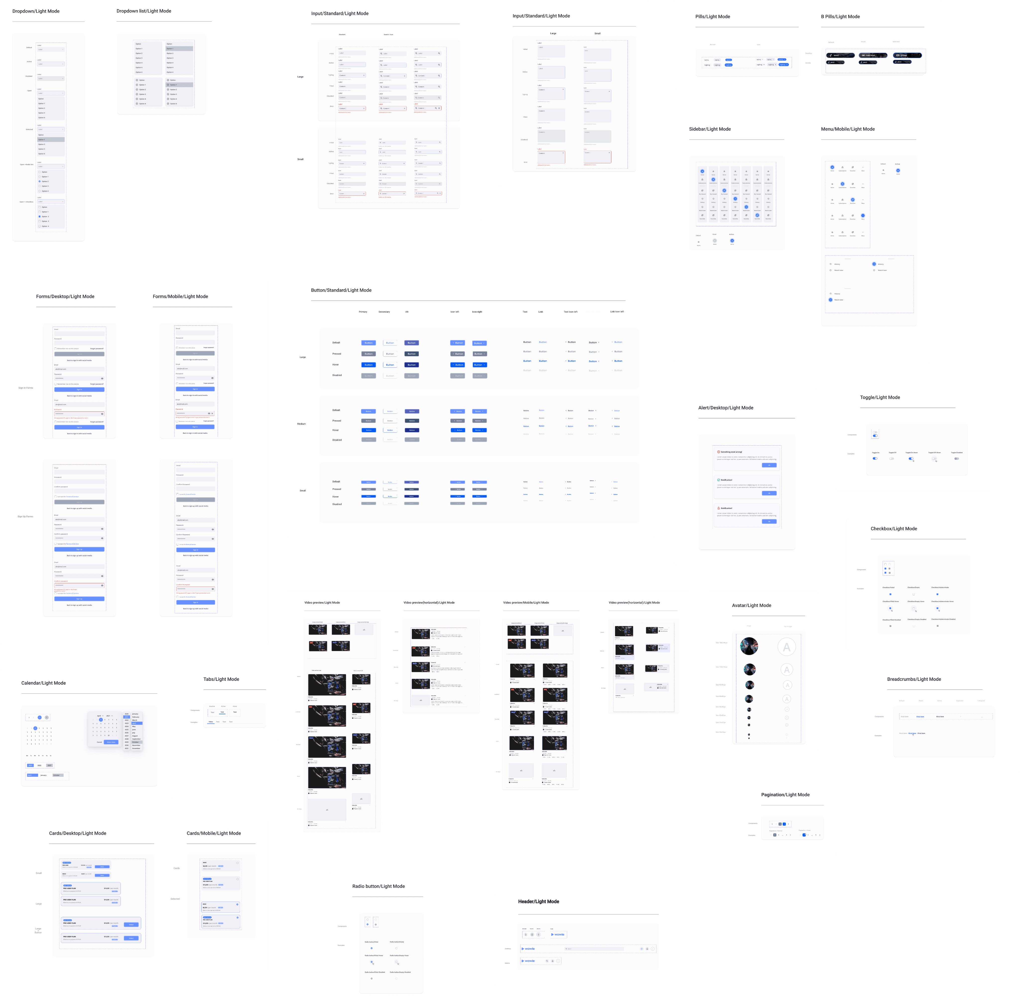
The entire design system was built from scratch with scalability in mind. It included:
Fully responsive components using auto layout
Variants and nested instances for flexibility
Design tokens for consistent spacing, color, and type
Reusable patterns for lists, modals, forms, and actions across all breakpoints.
This system allowed for rapid prototyping and efficient handoff, especially important since the developers were using Figma for the first time. It minimized ambiguity and supported smooth, scalable development across the product.
Here I want to talk more about the system design.
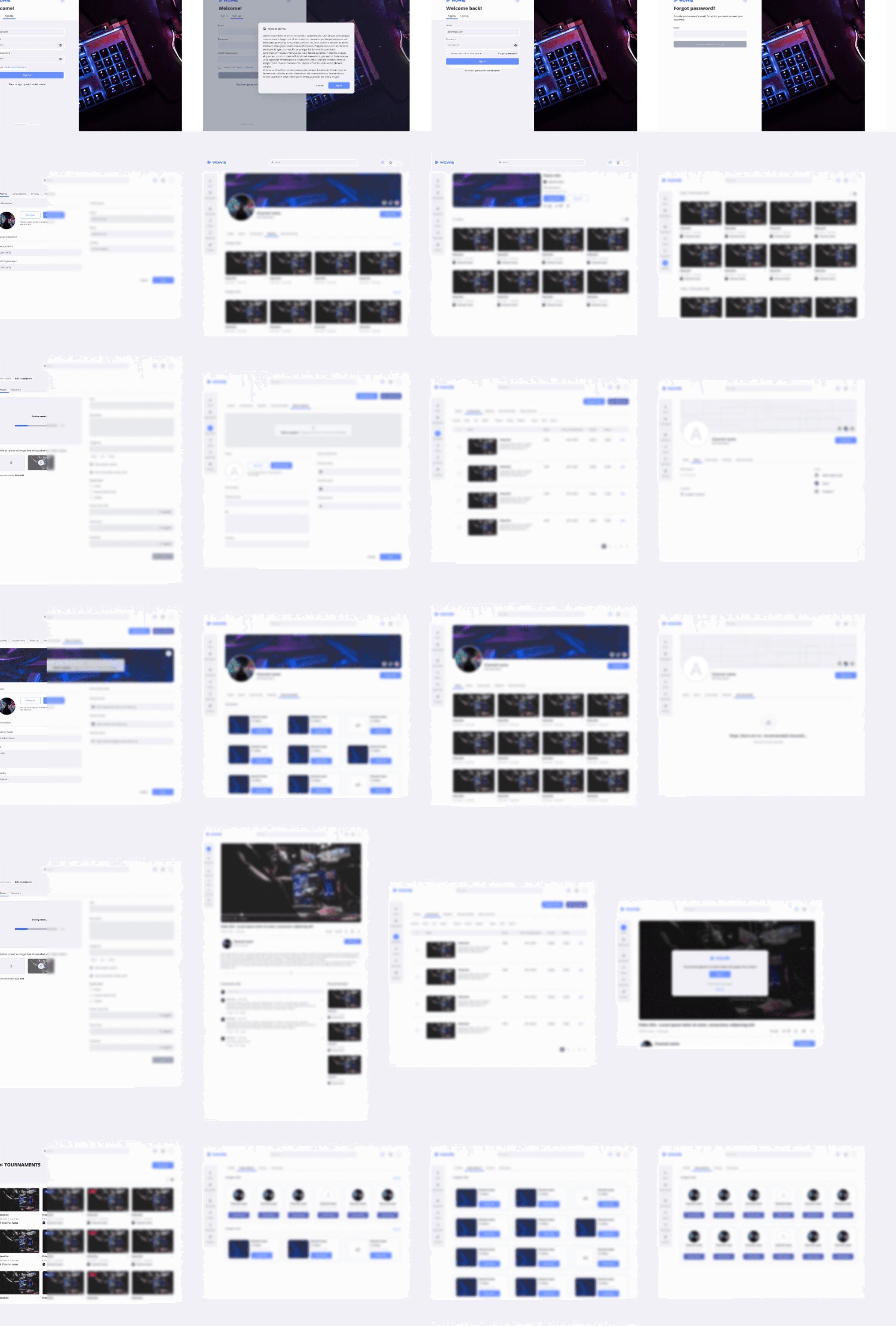


With the design system in place, I created a full set of high-fidelity wireframes across both dark and light modes to validate user flows and visual consistency.
The project was well-received by stakeholders and investors. The clarity of the product vision, strong user-centric design, and clean execution led to positive feedback and financial backing we secured a significant round of funding to support the next development phases.
However, shortly after, the war in Ukraine began. Due to the resulting instability and shift in company priorities, the project was put on hold indefinitely. While the product never launched publicly, it served as a powerful demonstration of our team’s ability to move from research to execution and gain serious investor confidence under real-world conditions.

My role
Led end-to-end UX design, including user research, ideation, wireframing, prototyping, and testing.
The team
Collaborated with a cross-functional team including product managers, mobile engineers (iOS/Android), QA, and front-/back-end developers.
Tools
Note: Due to NDA restrictions, I’m unable to share detailed visuals or all deliverables from this project. However, the following sections outline my process, approach, and key takeaways.
The client operates in the eSports industry, and this project was designed to offer users exclusive access to competitive gaming content.
My goal was to curate familiar UX patterns from leading content platforms and empower streamers by simplifying the broadcasting experience. The result: a tool that allows teams to easily invite and manage viewers for exclusive live streams.
OVERVIEW
How do you make a digital crowd feel like the best parts of being in a physical one?
Live streaming creates a one-way relationship powerful, but often isolating. I explored how to make this more inclusive, especially for users who can’t attend in person.
Through research and competitive analysis, I built a user journey map to identify key pain points. This helped me prioritize what to solve and where to focus my next design steps.
Research & Ideate
With a clear direction from research and journey mapping, I created the initial wireframes focused on usability and simplicity.
The goal was to ensure that the product felt intuitive from the first interaction, reducing barriers, eliminating confusion, and guiding users through key tasks with ease.
Wireframes
The initial results yielded some problems with our product. Though we were aware our solution wasn't fully refined, It was great to get specific data on the usability potential problems from a target audience firsthand. It's one thing to design based on your team's perspective, but it's another thing to design from a user-specific point of view that only has the information you give them and their own biases.
Testing
Solution
After gathering insights from research and user testing, I moved into high-fidelity design. This stage focused on creating a cohesive system that would scale across both desktop and mobile.
I developed:
A design system including typography, color, and component libraries
A style guide to maintain consistency across platforms
A high-fidelity interactive prototype used in usability testing
A centralized file structure for desktop, mobile, and user profile flows all housed in one organized Figma project
This structured approach allowed for faster iteration, clearer collaboration with developers, and better documentation for handoff.
Figma
All files were structured consistently to support both design clarity and developer collaboration. This included:
Separate layouts for dark and light modes
Clear page-level flows (e.g., upload, edit, playlist management, channel settings)
Dedicated files for desktop and mobile wireframes
A library of modular components reused across multiple views
High-Fidelity Wireframes
With the design system in place, I created a full set of high-fidelity wireframes across both dark and light modes to validate user flows and visual consistency.
DESIGN PROCESS

Based on the insights from the user journey map, I created the information architecture and key user flows for both the user and creator sides of the platform.

This level of organization was especially important because the developers were working with Figma for the first time. A clean, intuitive file structure helped minimize confusion, reduced onboarding time, and ensured smoother handoff, ultimately streamlining both the design and development processes while maintaining visual consistency across the product.
All design files followed a consistent organizational pattern, with clearly separated pages. This structure made it easy for both the design and development teams to find, reference, and collaborate on specific flows.
The entire design system was built from scratch with scalability in mind. It included:
Fully responsive components using auto layout
Variants and nested instances for flexibility
Design tokens for consistent spacing, color, and type
Reusable patterns for lists, modals, forms, and actions across all breakpoints.
This system allowed for rapid prototyping and efficient handoff, especially important since the developers were using Figma for the first time. It minimized ambiguity and supported smooth, scalable development across the product.
Here I want to talk more about the system design.


Results
The project was well-received by stakeholders and investors. The clarity of the product vision, strong user-centric design, and clean execution led to positive feedback and financial backing we secured a significant round of funding to support the next development phases.
However, shortly after, the war in Ukraine began. Due to the resulting instability and shift in company priorities, the project was put on hold indefinitely. While the product never launched publicly, it served as a powerful demonstration of our team’s ability to move from research to execution and gain serious investor confidence under real-world conditions.
The team
Collaborated with a cross-functional team including product managers, mobile engineers (iOS/Android), QA, and front-/back-end developers.
My role
Led end-to-end UX design, including user research, ideation, wireframing, prototyping, and testing.
Note: Due to NDA restrictions, I’m unable to share detailed visuals or all deliverables from this project. However, the following sections outline my process, approach, and key takeaways.
The client operates in the eSports industry, and this project was designed to offer users exclusive access to competitive gaming content.
My goal was to curate familiar UX patterns from leading content platforms and empower streamers by simplifying the broadcasting experience. The result: a tool that allows teams to easily invite and manage viewers for exclusive live streams.
OVERVIEW
Tools
DESIGN PROCESS
How do you make a digital crowd feel like the best parts of being in a physical one?
Live streaming creates a one-way relationship powerful, but often isolating. I explored how to make this more inclusive, especially for users who can’t attend in person.
Through research and competitive analysis, I built a user journey map to identify key pain points. This helped me prioritize what to solve and where to focus my next design steps.
Research & Ideate

Based on the insights from the user journey map, I created the information architecture and key user flows for both the user and creator sides of the platform.

With a clear direction from research and journey mapping, I created the initial wireframes focused on usability and simplicity.
The goal was to ensure that the product felt intuitive from the first interaction reducing barriers, eliminating confusion, and guiding users through key tasks with ease.
Wireframes
The initial results yielded some problems with our product. Though we were aware our solution wasn't fully refined, It was great to get specific data on the usability potential problems from a target audience firsthand. It's one thing to design based on your team's perspective, but it's another thing to design from a user-specific point of view that only has the information you give them and their own biases.
Testing
Solution
After gathering insights from research and user testing, I moved into high-fidelity design. This stage focused on creating a cohesive system that would scale across both desktop and mobile.
I developed:
A design system including typography, color, and component libraries
A style guide to maintain consistency across platforms
A high-fidelity interactive prototype used in usability testing
A centralized file structure for desktop, mobile, and user profile flows all housed in one organized Figma project
This structured approach allowed for faster iteration, clearer collaboration with developers, and better documentation for handoff.

This level of organization was especially important because the developers were working with Figma for the first time. A clean, intuitive file structure helped minimize confusion, reduced onboarding time, and ensured smoother handoff, ultimately streamlining both the design and development processes while maintaining visual consistency across the product.
All design files followed a consistent organizational pattern, with clearly separated pages. This structure made it easy for both the design and development teams to find, reference, and collaborate on specific flows.
The entire design system was built from scratch with scalability in mind. It included:
Fully responsive components using auto layout
Variants and nested instances for flexibility
Design tokens for consistent spacing, color, and type
Reusable patterns for lists, modals, forms, and actions across all breakpoints.
This system allowed for rapid prototyping and efficient handoff, especially important since the developers were using Figma for the first time. It minimized ambiguity and supported smooth, scalable development across the product.
Here I want to talk more about the system design.
High-Fidelity Wireframes
With the design system in place, I created a full set of high-fidelity wireframes across both dark and light modes to validate user flows and visual consistency.


Results
The project was well-received by stakeholders and investors. The clarity of the product vision, strong user-centric design, and clean execution led to positive feedback and financial backing we secured a significant round of funding to support the next development phases.
However, shortly after, the war in Ukraine began. Due to the resulting instability and shift in company priorities, the project was put on hold indefinitely. While the product never launched publicly, it served as a powerful demonstration of our team’s ability to move from research to execution and gain serious investor confidence under real-world conditions.