How I turned a fragmented tool into a secure, scalable, and user-friendly control center.
As Lead Product Designer, I owned the end-to-end design process from uncovering operational pain points to delivering a fully scalable solution. I worked closely with Product, Engineering, and Customer Success to align vision, validate solutions, and ensure smooth adoption.
Key responsibilities:
Audited existing workflows to pinpoint bottlenecks and inefficiencies
Defined the information architecture and content model for device data
Designed and mapped role-based permissions to balance security and usability
Created low- and high-fidelity prototypes, validating concepts with real users
Partnered with engineers on API contracts, data structures, and interaction states
Led rollout, training, and post-launch iteration based on usage data and feedback
Impact:
Redesigned device management to:
Cut resolution time by 50%
Eliminate reliance on incomplete external tools
Enable seamless scaling to 10,000+ devices across global locations
Keyo builds biometric identity systems that replace keys, cards, and passwords with the wave of a hand.
When I joined, device management was the biggest bottleneck. Teams jumped between disconnected tools, static spreadsheets, and manual processes to answer critical questions:
Where is this device? Who owns it? Is it online? What changed?
The lack of a central source of truth slowed incident response, increased operational risk, and undermined trust in the data.
We needed a single, authoritative source of truth for every device’s lifecycle one that met the needs of field technicians, developers, and Customer Success without sacrificing clarity, speed, or security.
It had to:
Scale with a fast-growing global fleet
Respect complex permission structures
Replace two costly external tools that still lacked key features
Rapid growth was amplifying the pain. Devices were shipping to more locations than ever, and without accessible status and history, even minor incidents triggered multi-person investigations.
The opportunity was clear: create a platform that served field technicians, developers, and Customer Success equally streamlining workflows, reducing costs, and enabling confident, data-driven decisions.
The redesign aimed to be more than a usability upgrade; it set out to create the scalable, reliable backbone for Keyo’s global device operations. I defined five guiding goals to ensure the solution would serve every role, from field technicians to executives:
Unify device data into a single source of truth so every team could make decisions with confidence.
Make health signals and history instantly clear and actionable to prevent downtime before it escalates.
Enable fast, decisive action with visible ownership, clear audit trails, and accountability at every step.
Design for scale to support hundreds of devices today and thousands tomorrow across global locations.
Protect sensitive operations with role-based permissions tailored to complex organizational needs.
By launch, the solution had been tested in real-world workflows, integrated seamlessly into the platform, and equipped with critical tools for confident device management at scale.

We moved from discovery to launch through structured, iterative steps, ensuring alignment with Product, Engineering, and Support at every stage. From defining the vision to delivering a validated, scalable solution, each sprint was anchored in real user needs, technical feasibility, and security standards.
Instead of designing in isolation, we embedded design in the product development rhythm:
Before touching any layouts, I started with a deep dive into role-based needs. Every dashboard role from workspace owners to support staff, was mapped against its goals, permissions, and real-world constraints.
This wasn’t just about “what users want” it was about uncovering how their operational reality shaped the way they’d interact with device data.
Role-by-role capability mapping showing exactly what each user can (and cannot) do in Device Management.

Design implication mapping that linked needs and constraints to specific navigation, content hierarchy, and permission logic decisions.


This mapping directly shaped navigation, content hierarchy, and permission logic.
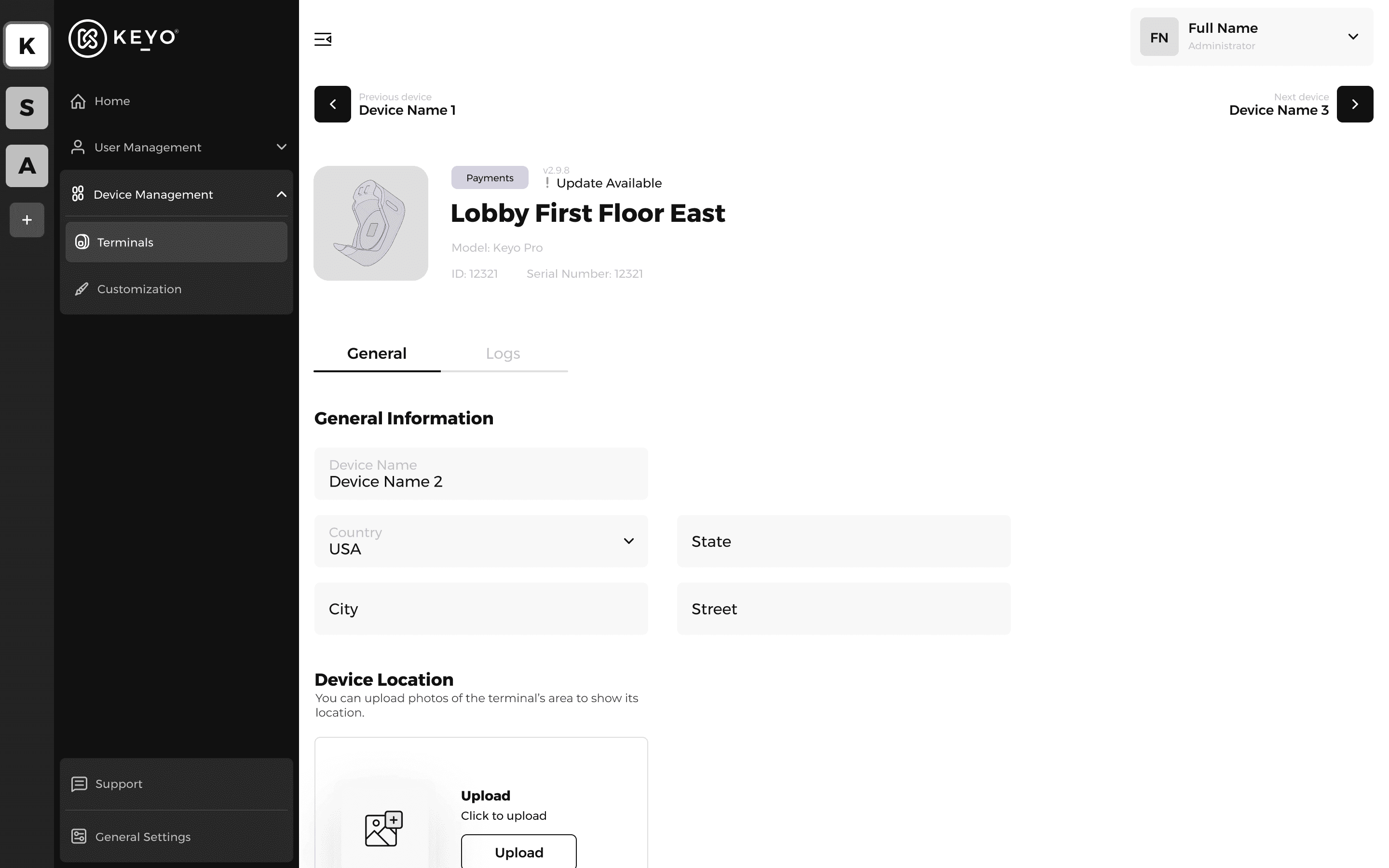
To move fast without compromising on clarity, I began with low-fidelity wireframes. This allowed me to validate ideas, test navigation patterns, and align early with engineering before investing in polished visuals.
At this stage, the goal wasn’t pixel perfection it was to:
De-risk development by resolving layout and interaction uncertainties early.
Compare multiple design directions quickly and cheaply.
Facilitate collaboration with product and engineering by focusing conversations on structure, not styling.
By the time we moved to high-fidelity design, the core flows were tested, validated, and agreed upon by all stakeholders, ensuring the final UI build was smooth and risk-free.

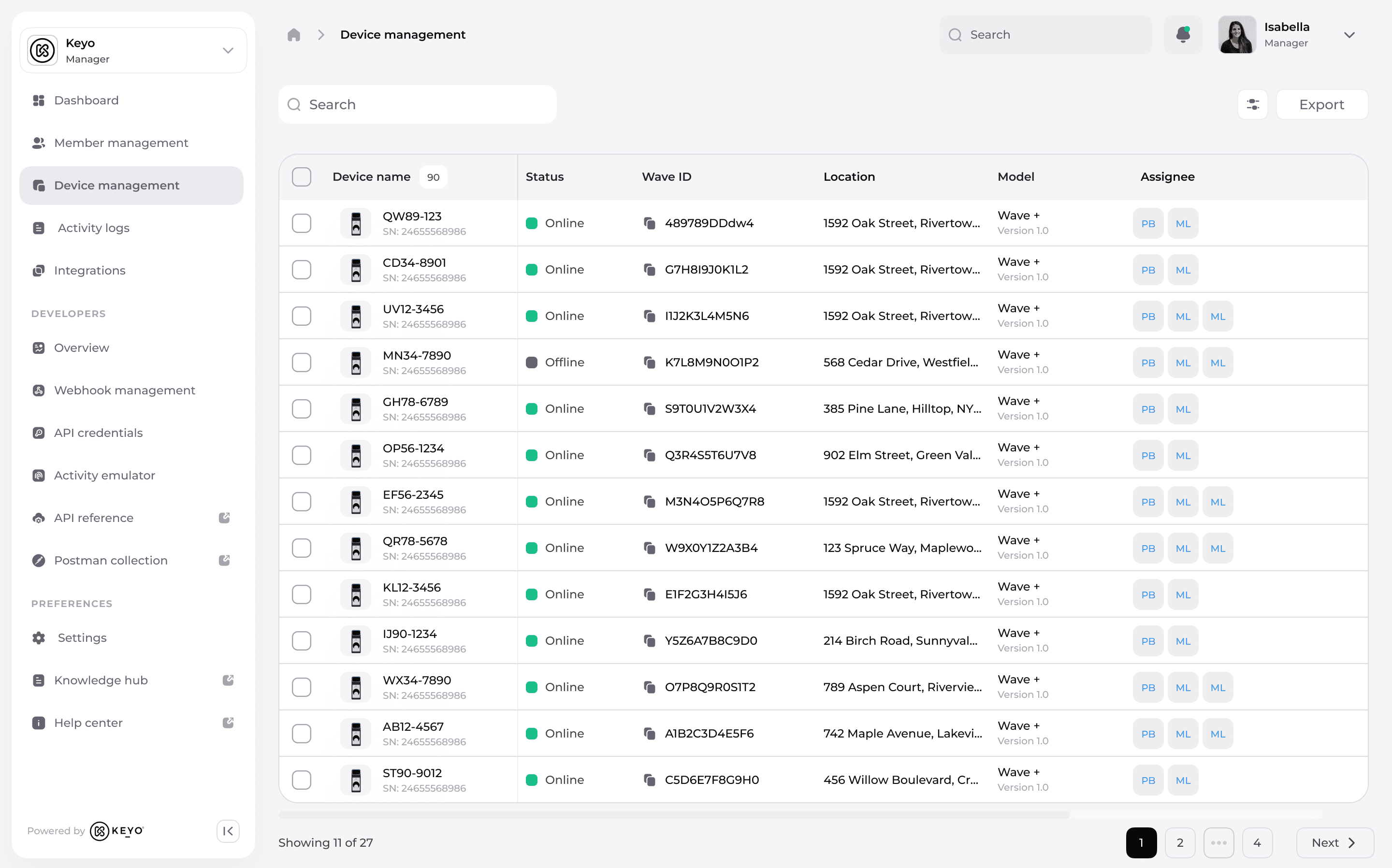
Our old dashboard lacked depth, flexibility, and the ability to adapt to role-specific needs. This forced teams to juggle multiple external tools tools that still couldn’t deliver all the required features.
The redesign focused on building a complete, role-aware system that not only eliminated reliance on third-party software but also made critical insights instantly accessible.
Before:
Static table with limited columns and no contextual actions.
Health status shown only as basic icons with no detail.

After:
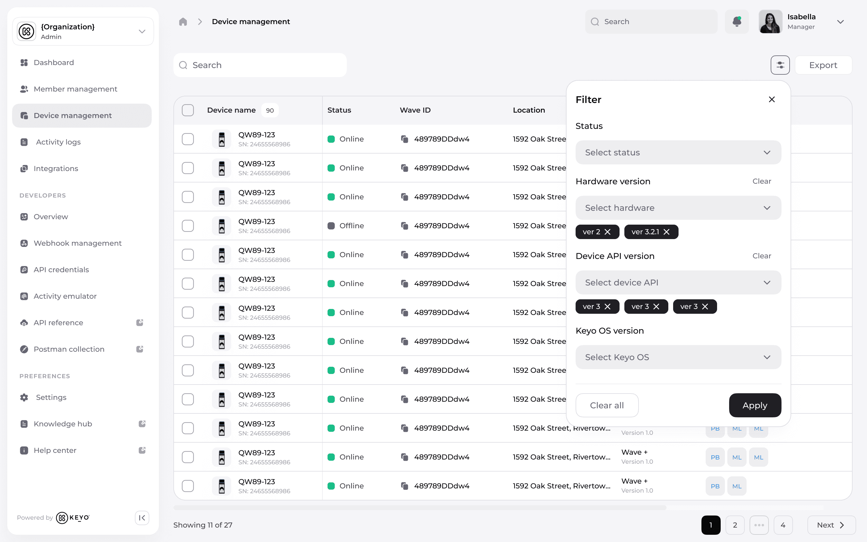
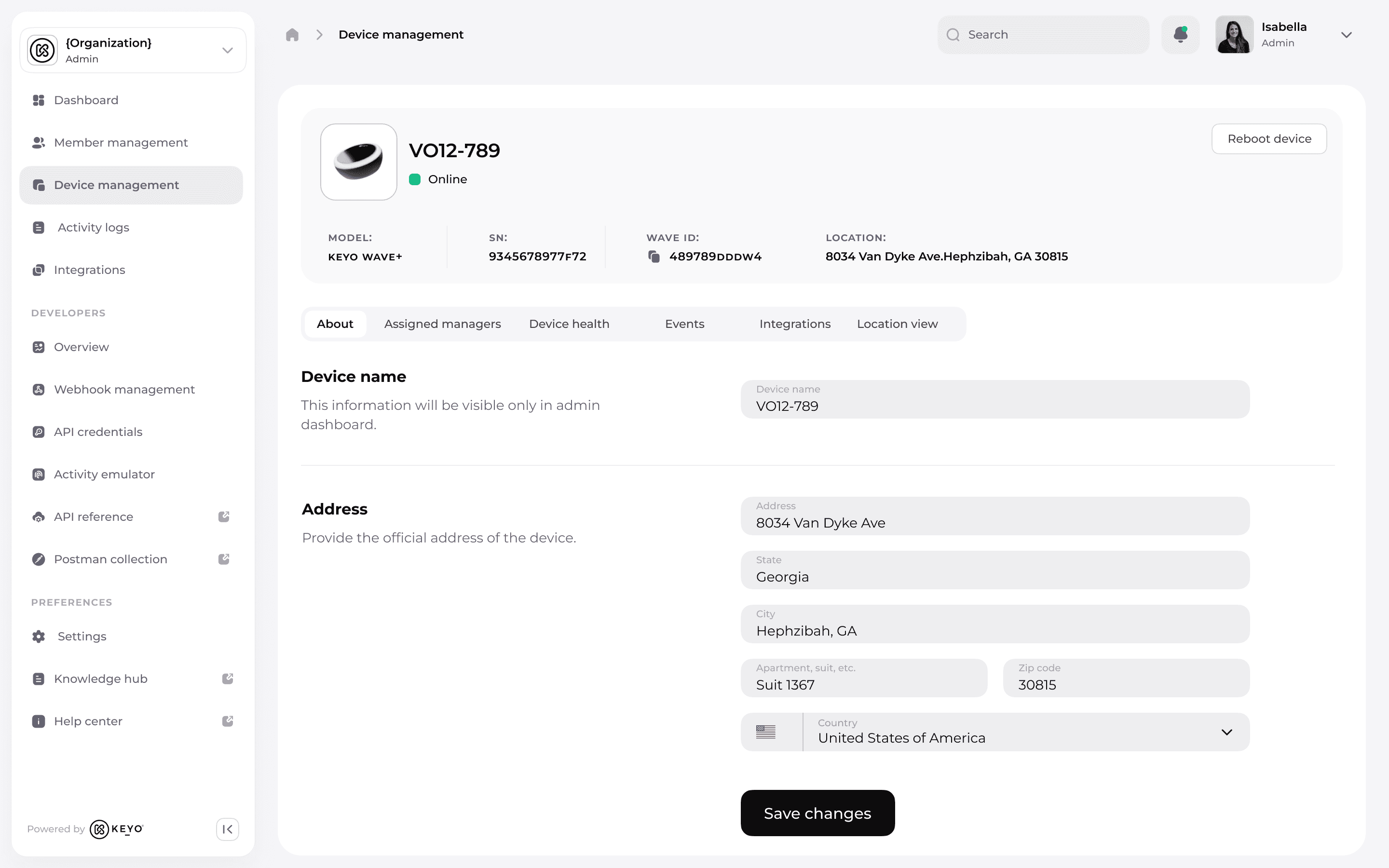
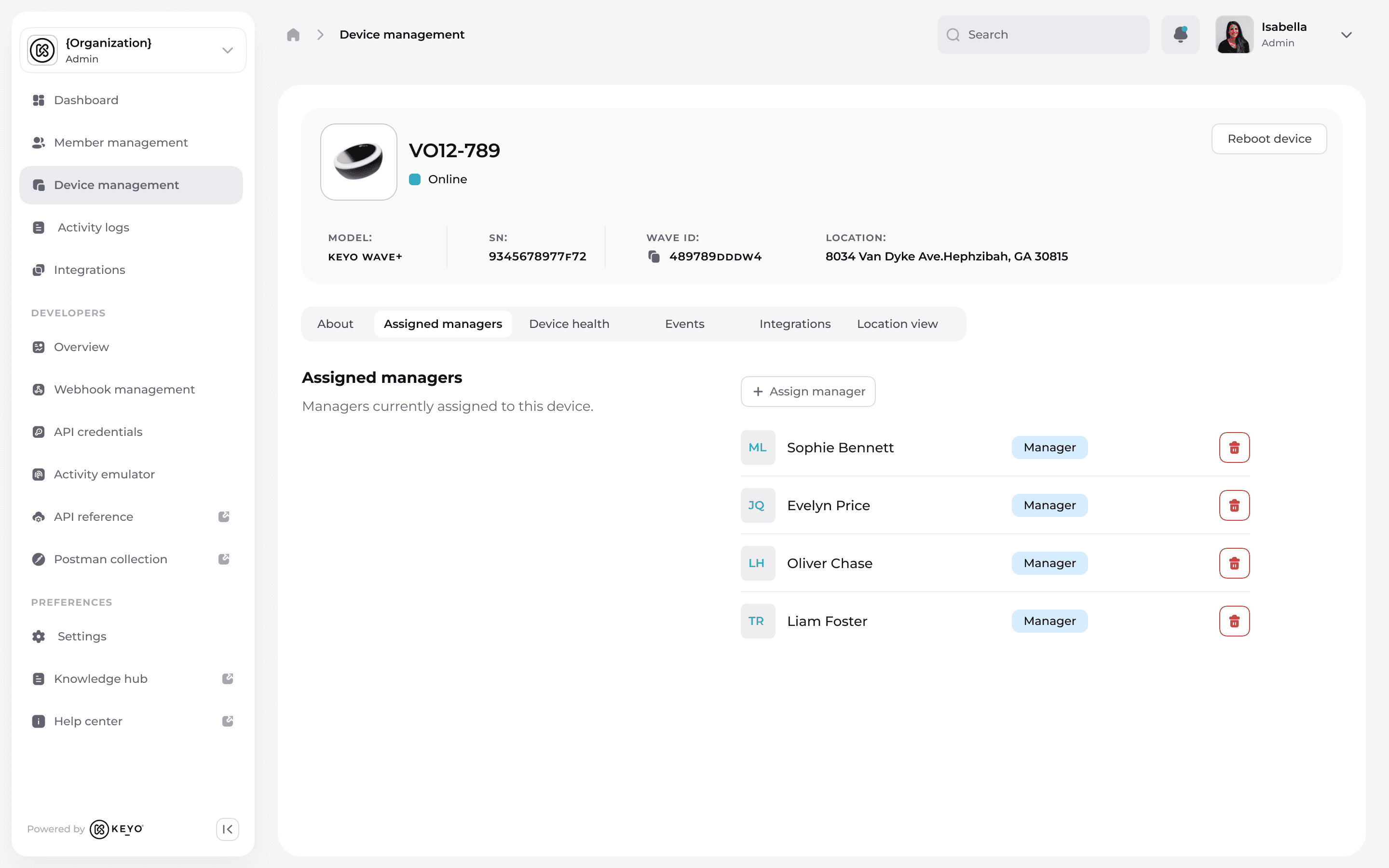
Role-aware columns that adapt to user permissions.
Quick actions for ownership assignment, viewing logs, and filtering.
Persistent search and filters to reduce time-to-find for large fleets.
Before:
Minimal information: basic location and metadata fields.
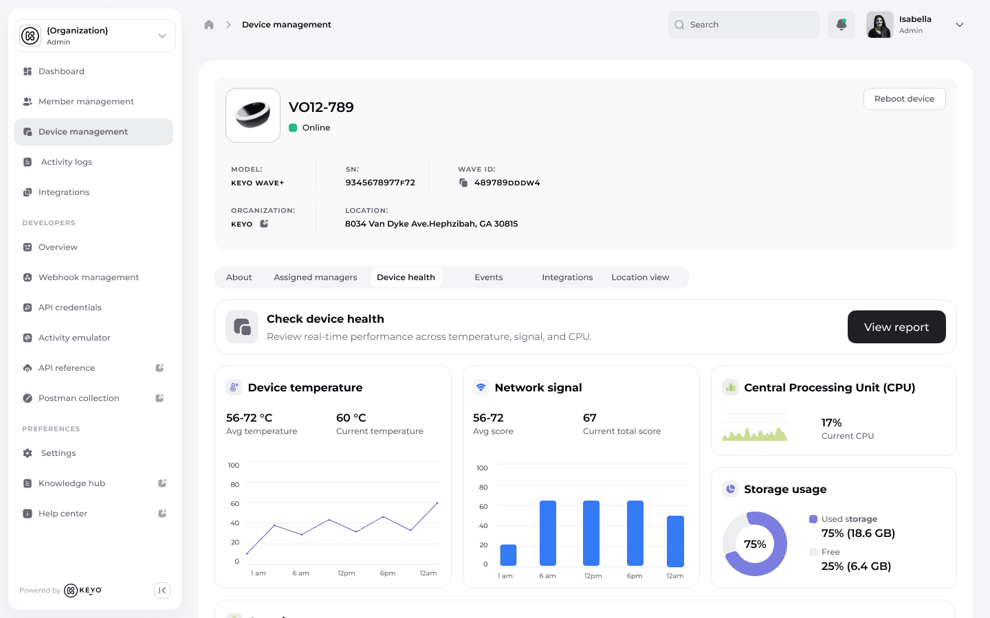
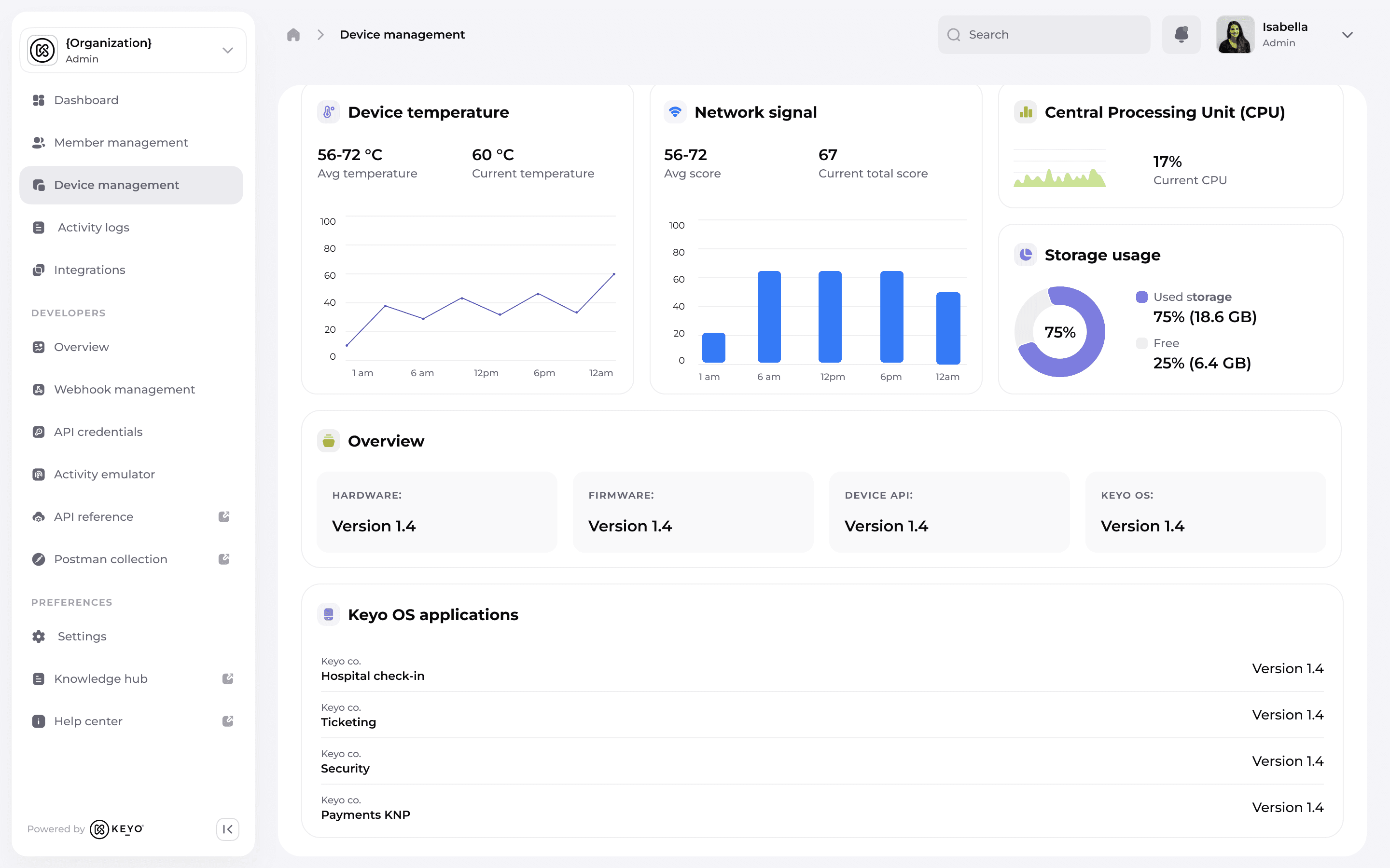
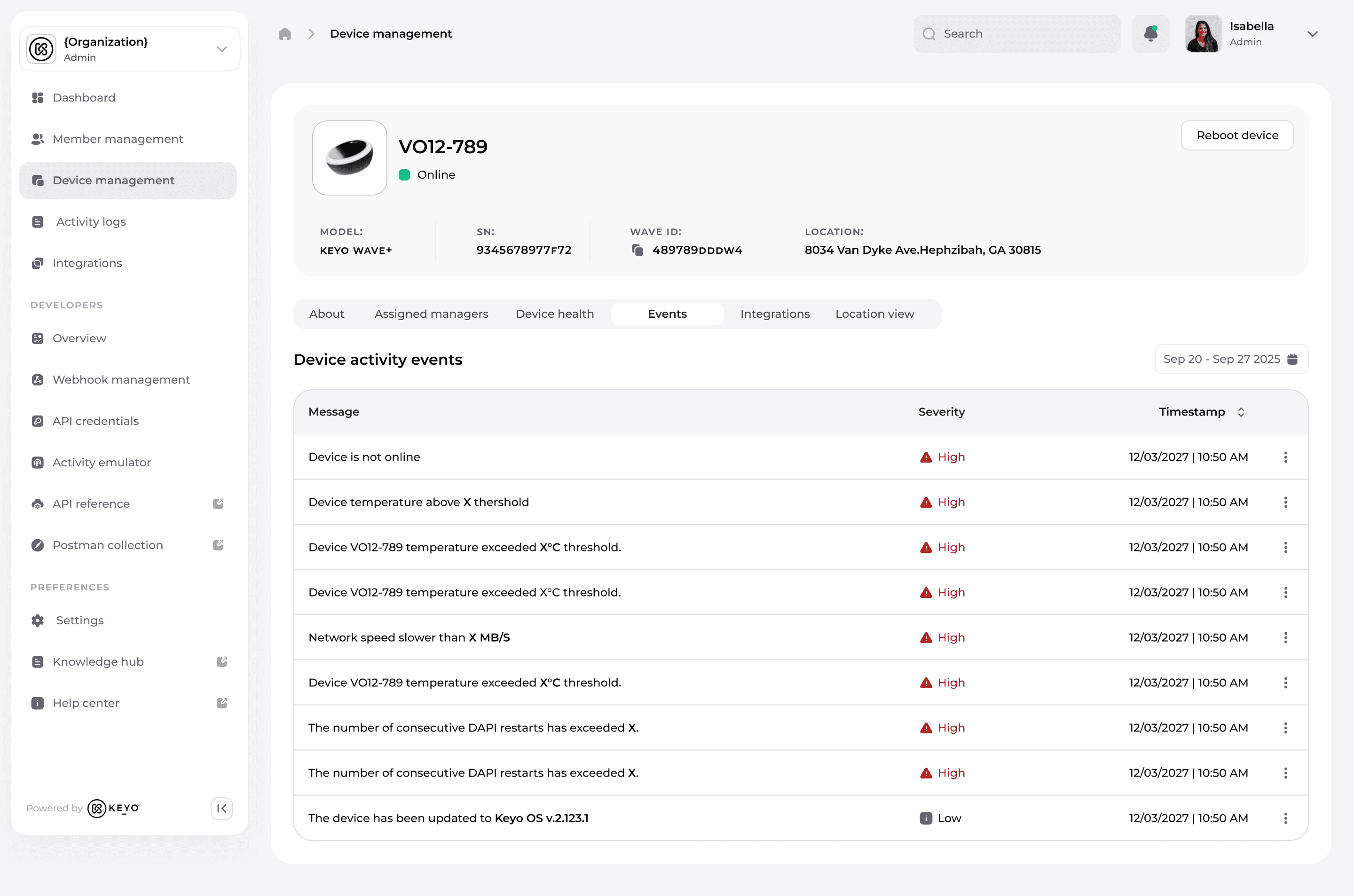
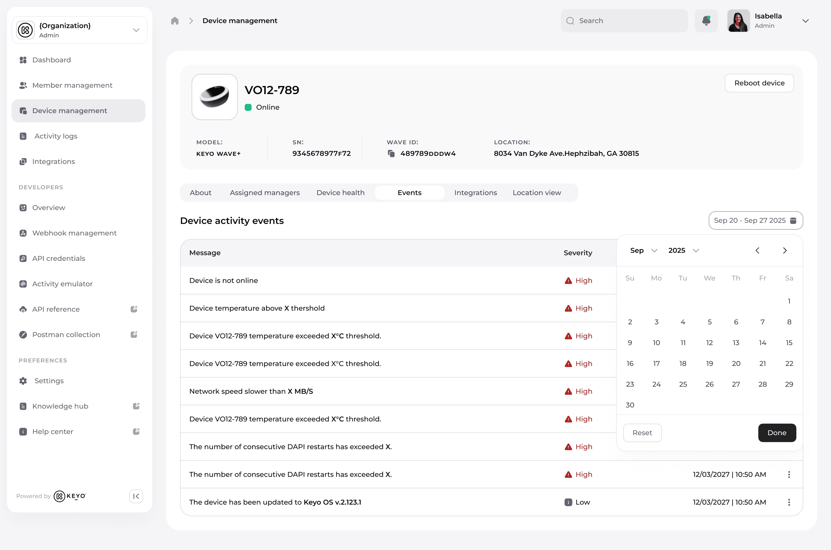
No visibility into performance or health trends.
After:
Responsive layouts for large datasets.
Persistent filters and saved views for different roles.
Accessibility-compliant color system for health states.
Scalable information architecture ready for future modules.


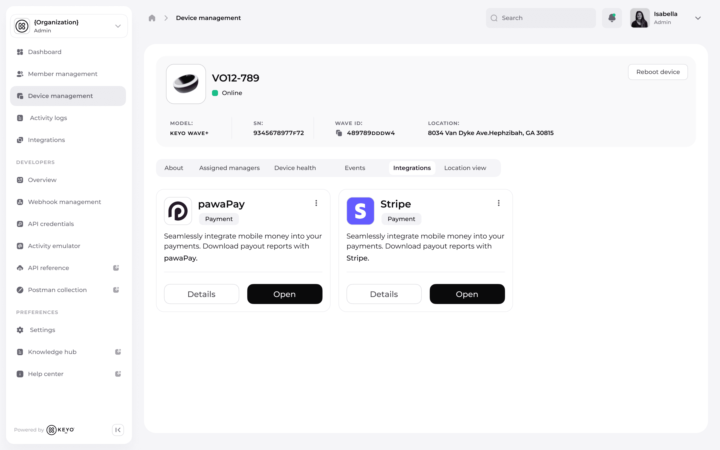
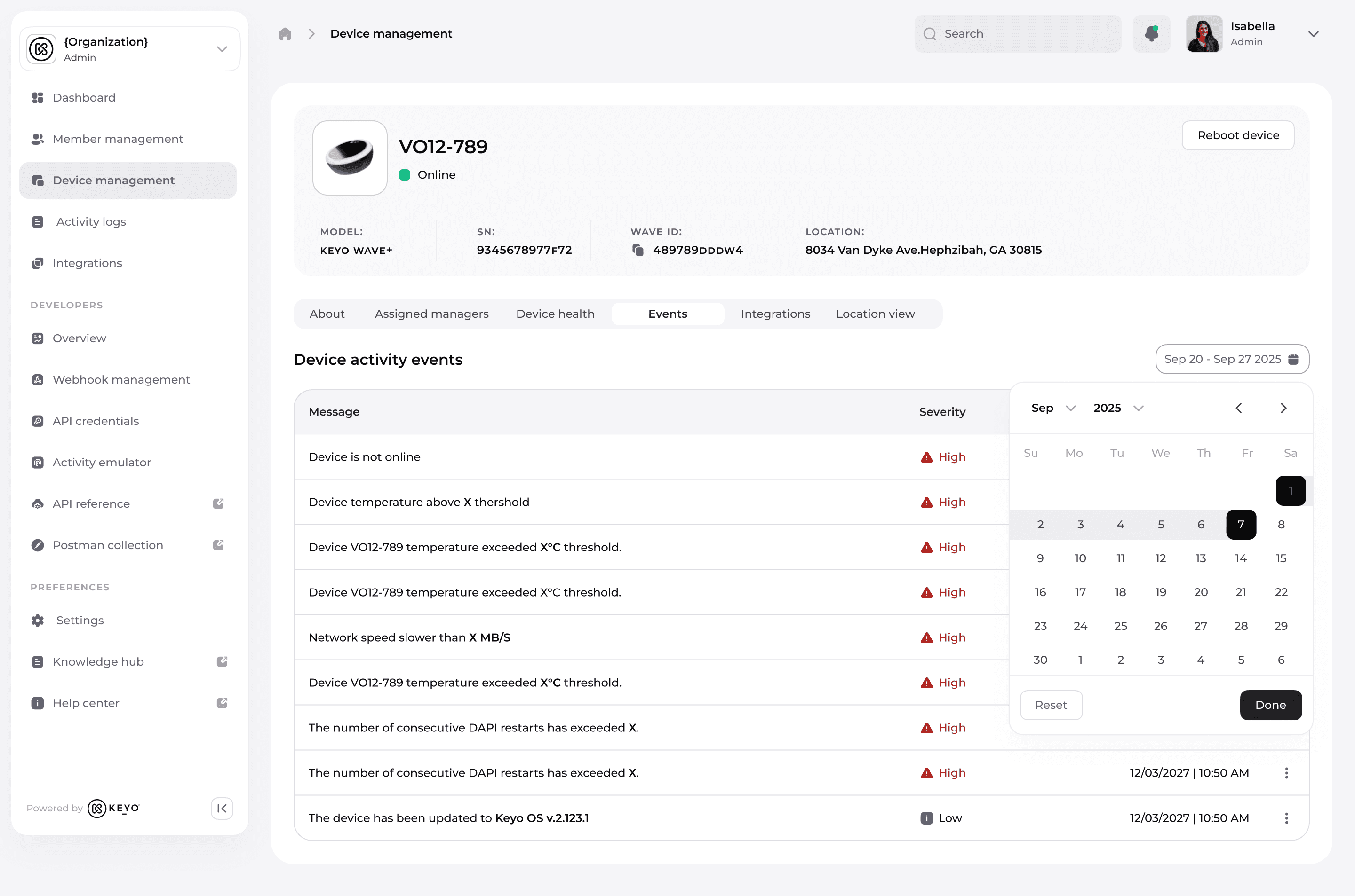
With validated wireframes in place, I moved into high fidelity bringing clarity, scalability, and speed to life. This phase combined role-based intelligence, accessibility, and visual polish, transforming the concept into a ready-to-ship product. Persistent filters let teams save preferred views, eliminating repetitive setup.
Surface-level health and logs enabled instant troubleshooting, cutting investigation time.
Role-specific layouts reduced noise, prevented access errors, and kept focus on critical tasks.
Consistent, accessible UI aligned with Keyo’s design system, enabling effortless scaling to 10,000+ devices.

I delivered a fully documented, engineering-ready package complete with component specs, responsive behaviors, interaction patterns, and empty states ensuring developers could build without ambiguity and future teams could scale without friction.
Outcomes
The redesigned Device Management system replaced a fragmented, inefficient process with a single, scalable source of truth. By consolidating tools, streamlining workflows, and aligning the interface with real user needs, we reduced operational friction, saved costs, and gave every role the clarity and control they needed to work effectively.
35% reduction in device-related support tickets within the first quarter freeing support teams to focus on high-value cases.
Removed dependency on two external tools, cutting annual spend and eliminating tool-switching for support and ops.
Boosted trust in device data accuracy, enabling faster, more confident decision-making for support and operations.
"I can finally see everything I need in one place it’s a game changer."
– Customer Success Manager, Keyo
The redesign didn’t just improve efficiency it became the single source of truth for Keyo’s device operations, scaling seamlessly to support 10,000+ devices worldwide.