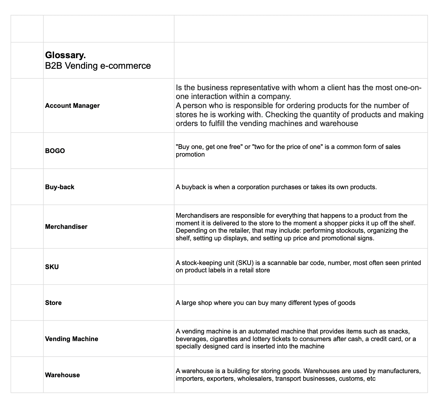
Documentation analysis
Key actions
Usability check
Design System
Wireframes
Approaches & Process
SOLUTION
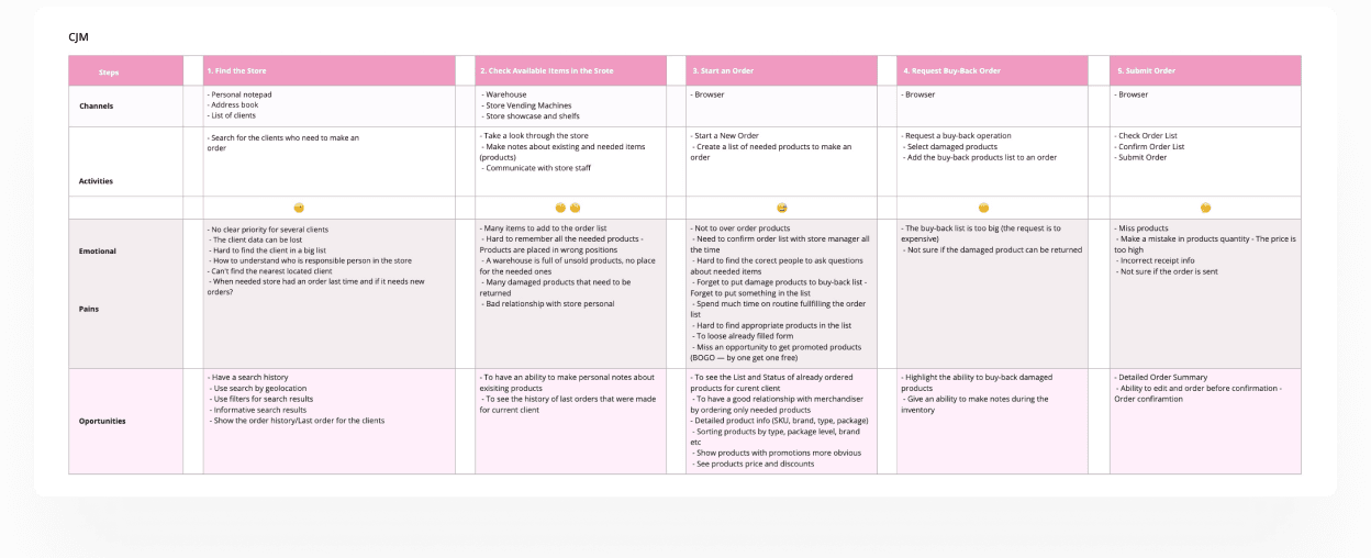
No order history: Users can’t view or reference past orders, making it difficult to reorder, track customer behavior, or resolve discrepancies.
Insufficient client information: Limited access to customer data prevents personalized service and informed decision-making during visits.
Inaccurate product quantities due to manual entry errors
Uncertainty about order submission users aren’t sure if the order was successfully sent
Missing items in orders caused by oversight or lack of confirmation
Incorrect receipt details such as pricing, totals, or product names
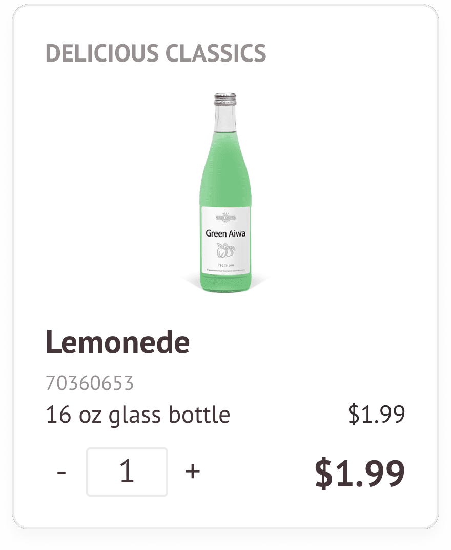
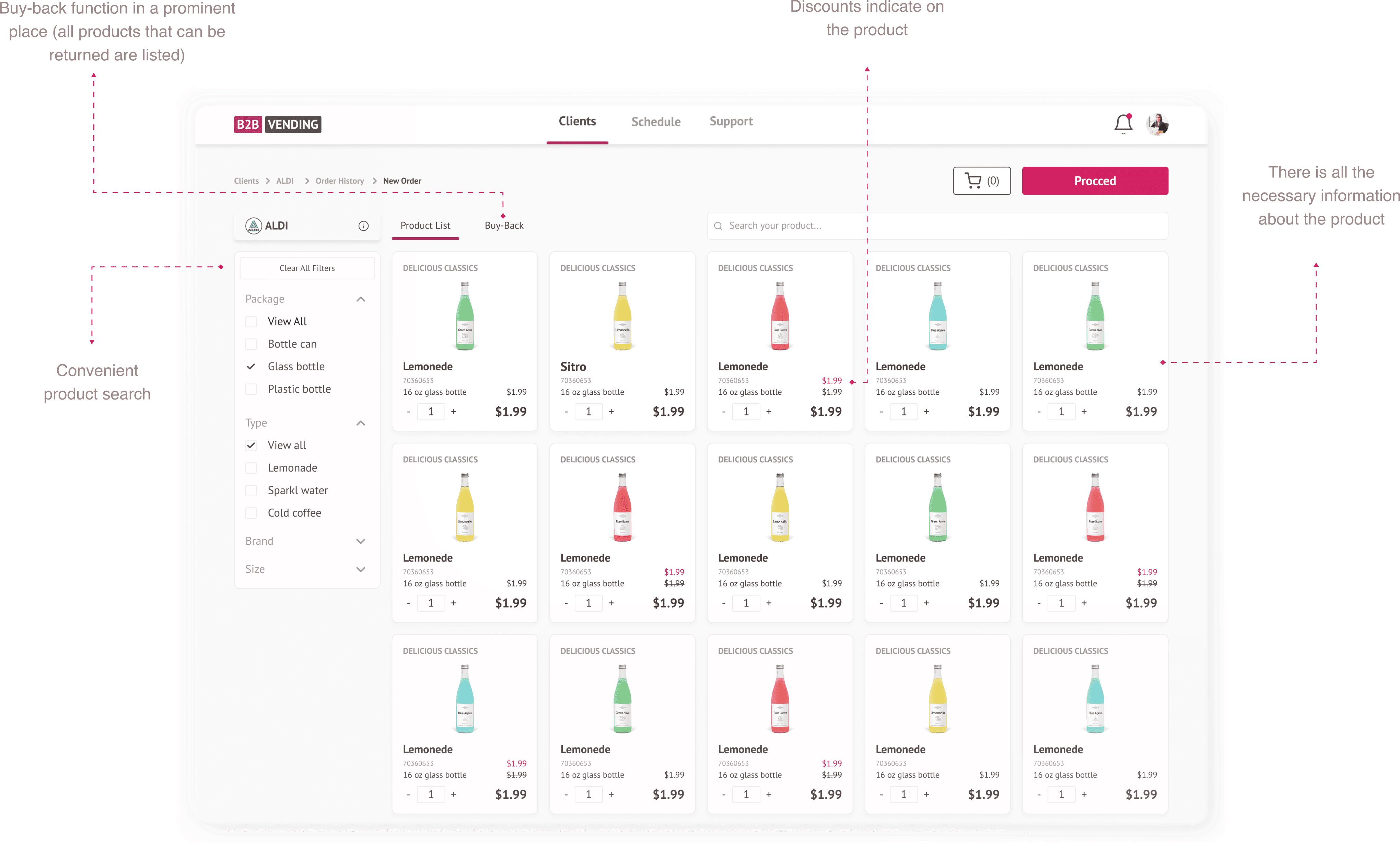
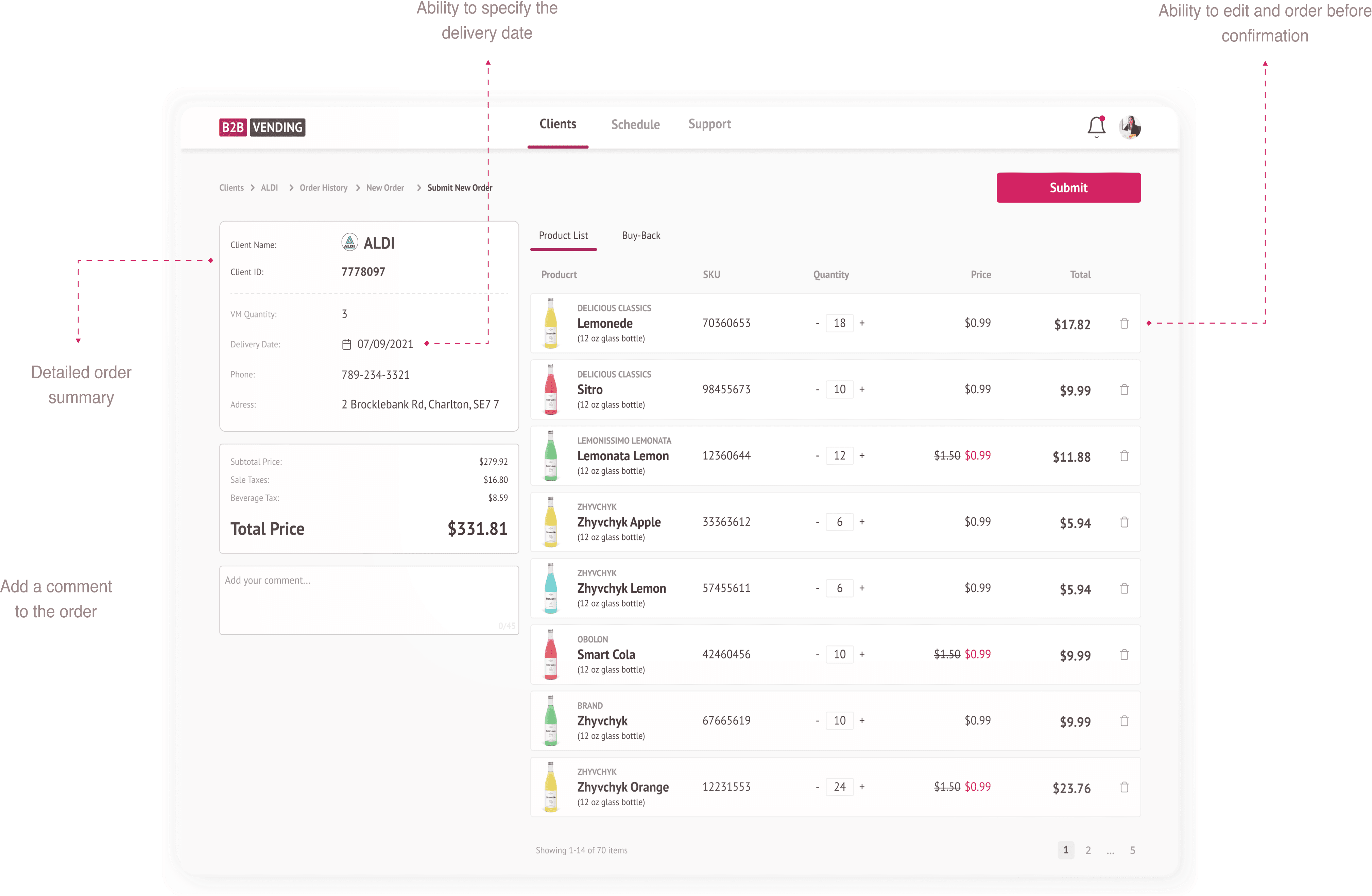
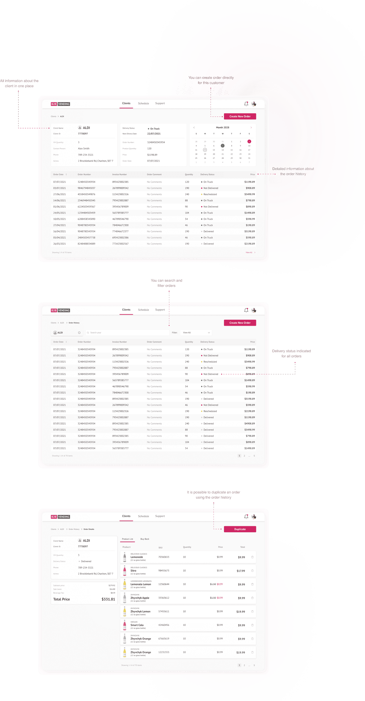
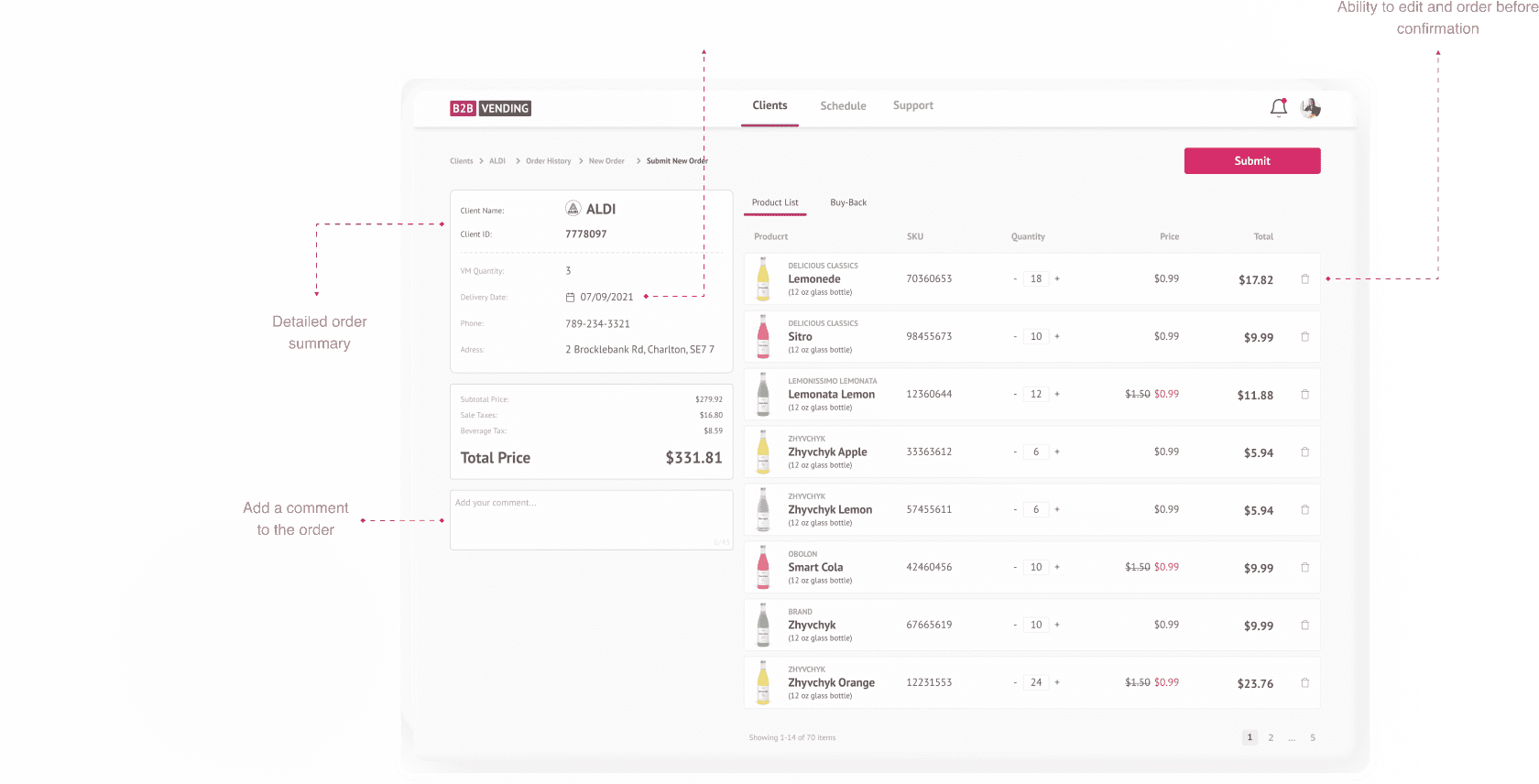
There is all the necessary information about the product
Ability to edit and order before confirmation


To lay a strong foundation, I started by gathering and organizing key documentation. This included understanding stakeholder KPIs, analyzing current reporting workflows, mapping user roles and access levels, and reviewing existing pain points and feature requests. This comprehensive discovery process ensured the design was aligned with both user needs and business goals.
Prioritized simplicity for fast order input
We chose a single-screen layout with pre-filled fields based on past orders, rather than a multi-step flow. This reduced average input time by ~30%.
Offline-first architecture
Connectivity in the field was unreliable. I worked closely with engineers to ensure the app cached key data locally, syncing automatically when reconnected.
Designed for both web and tablet
The sales team used various devices. I created responsive layouts with tap-friendly UI, large buttons, and minimized data entry.
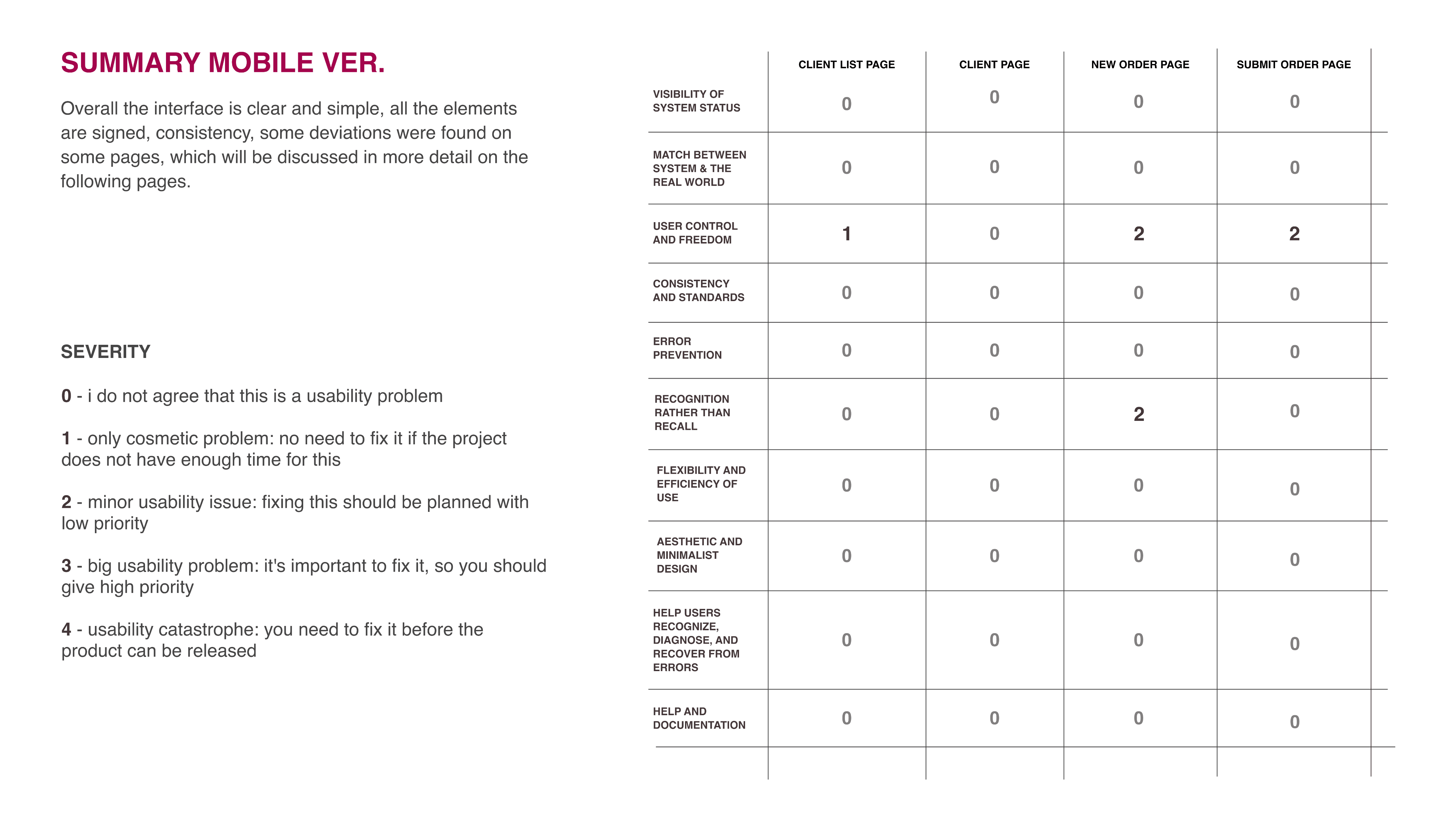
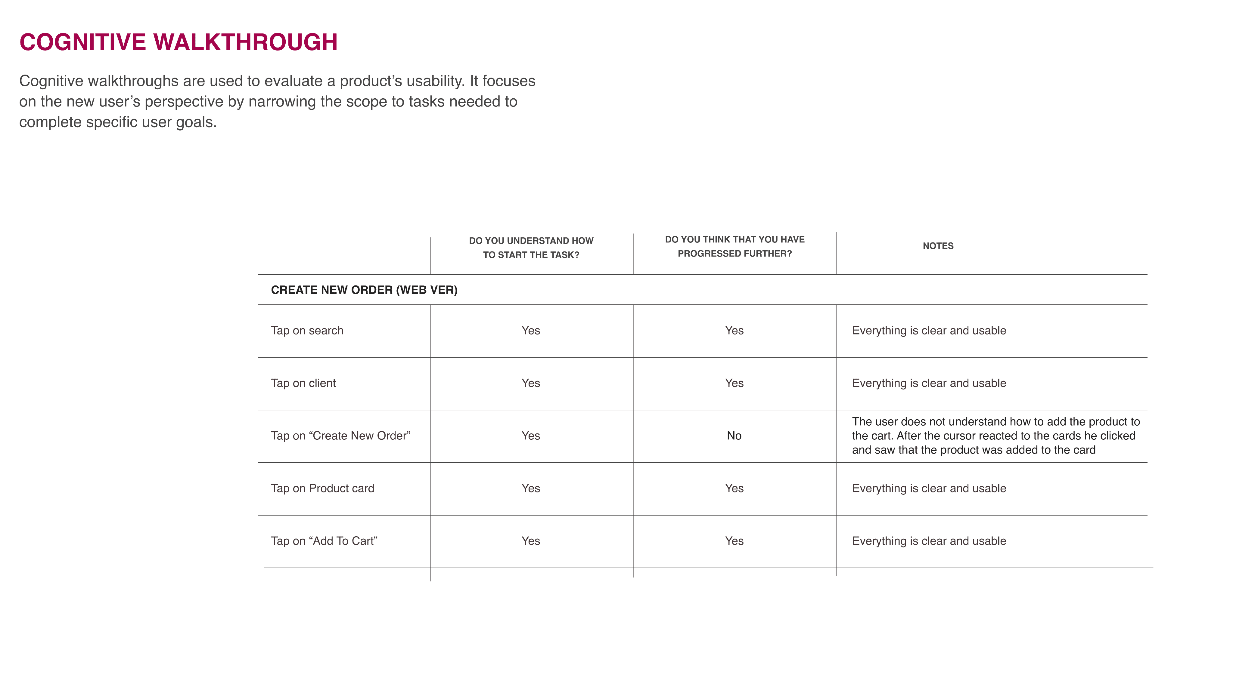
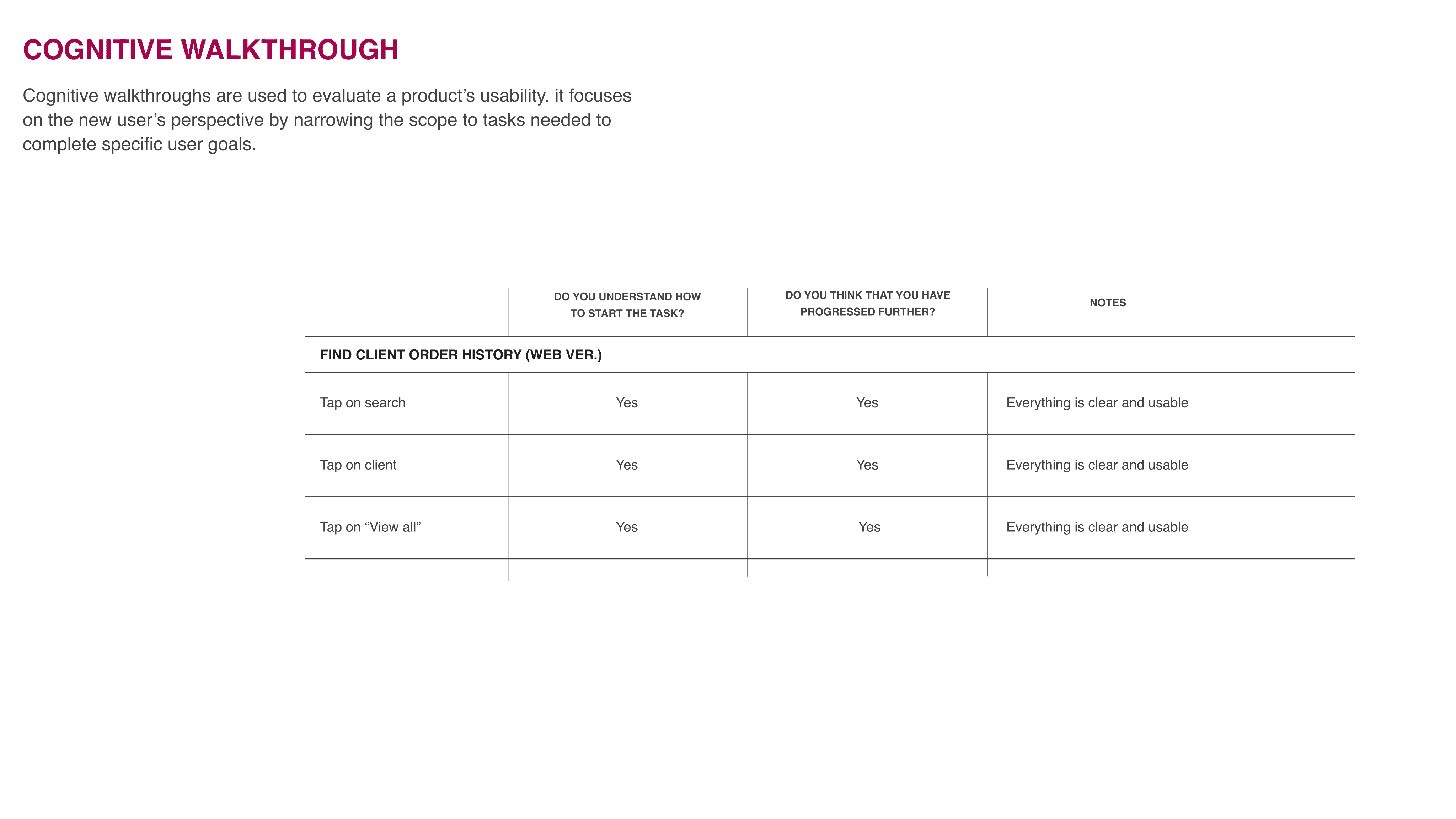
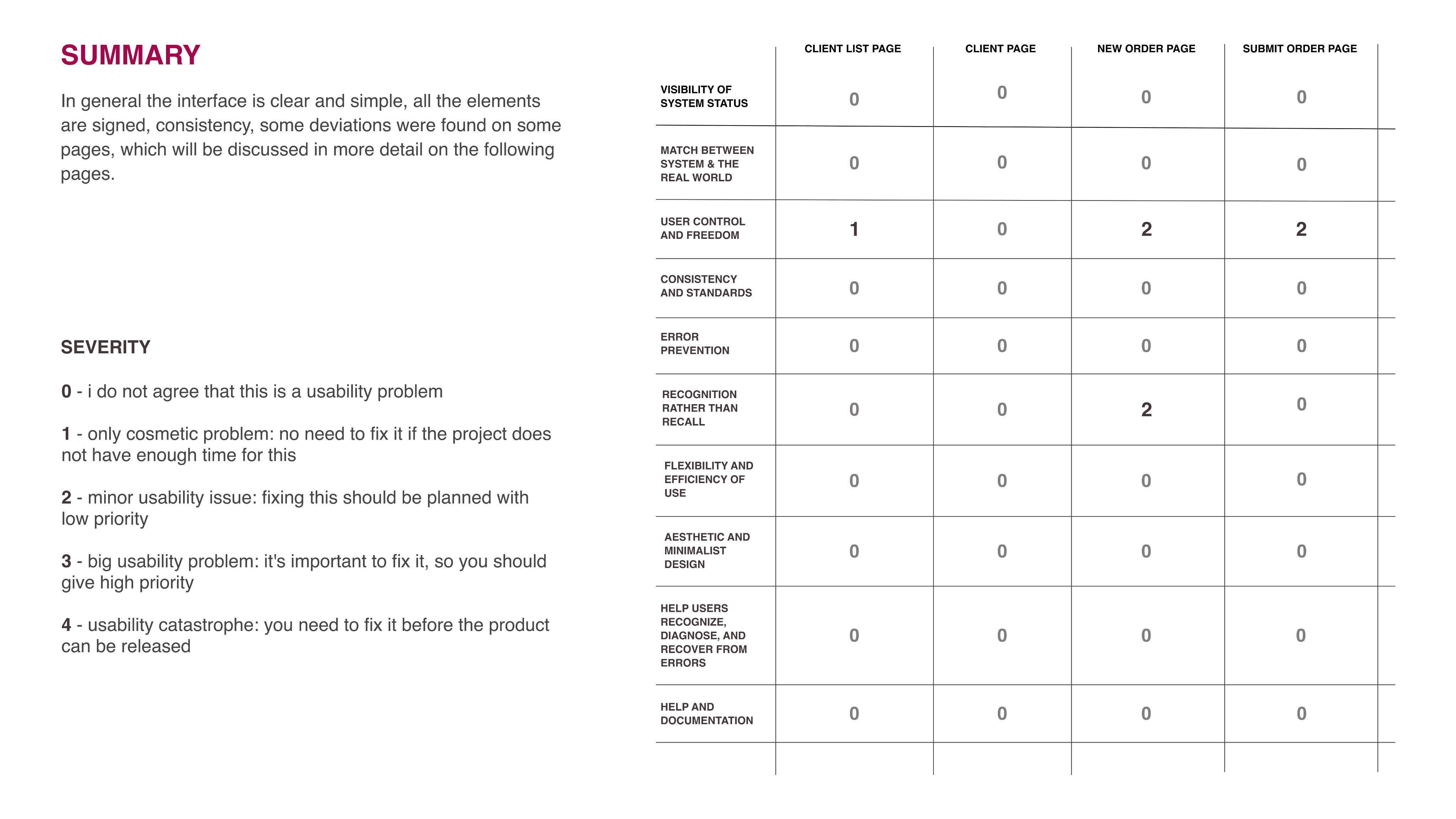
I used heuristic analysis and cognitive walkthroughs to evaluate whether my design ideas aligned with usability best practices and supported users in completing key tasks effectively.
Implemented scalable, reusable components using auto layout, improving design consistency and reducing update time across the product.
I began with sketches to explore layout ideas, then moved to mid-fidelity wireframes for testing. The design focused on clarity, easy access to actions like filtering and exporting, and strategic use of color to highlight performance.

Mockups & Prototyping
Created pixel-perfect mockups using real user data and translated them into interactive prototypes in Figma. This allowed for early usability testing, which surfaced key friction points and reduced design iteration time.
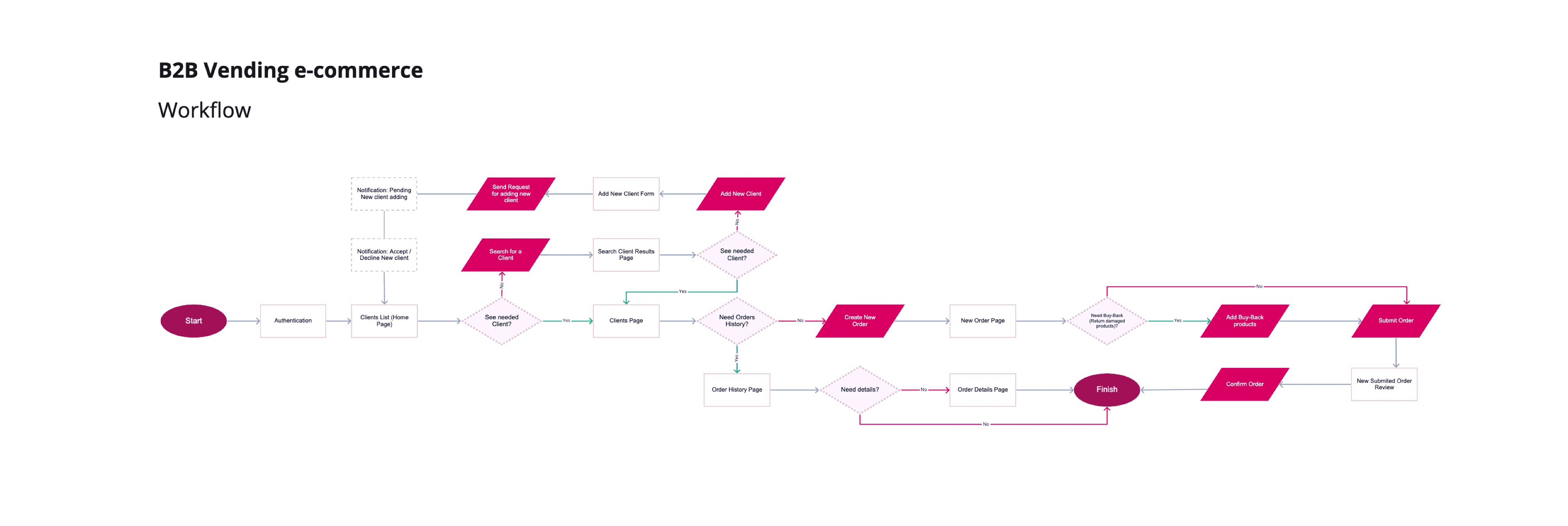
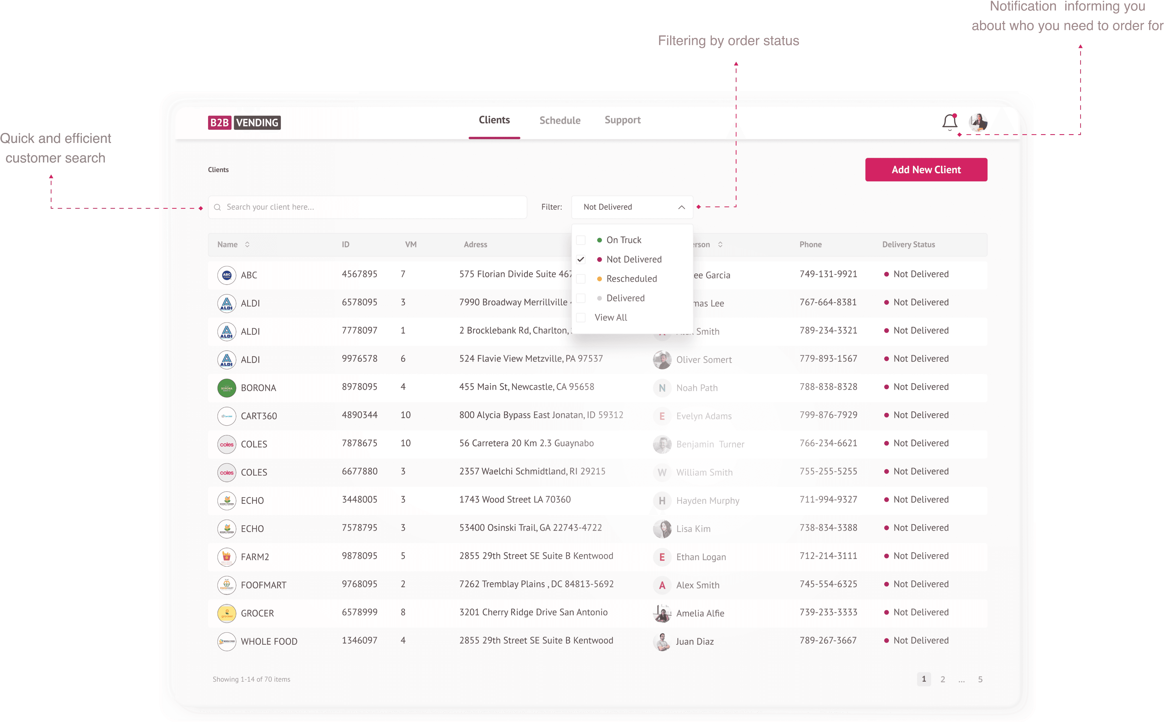
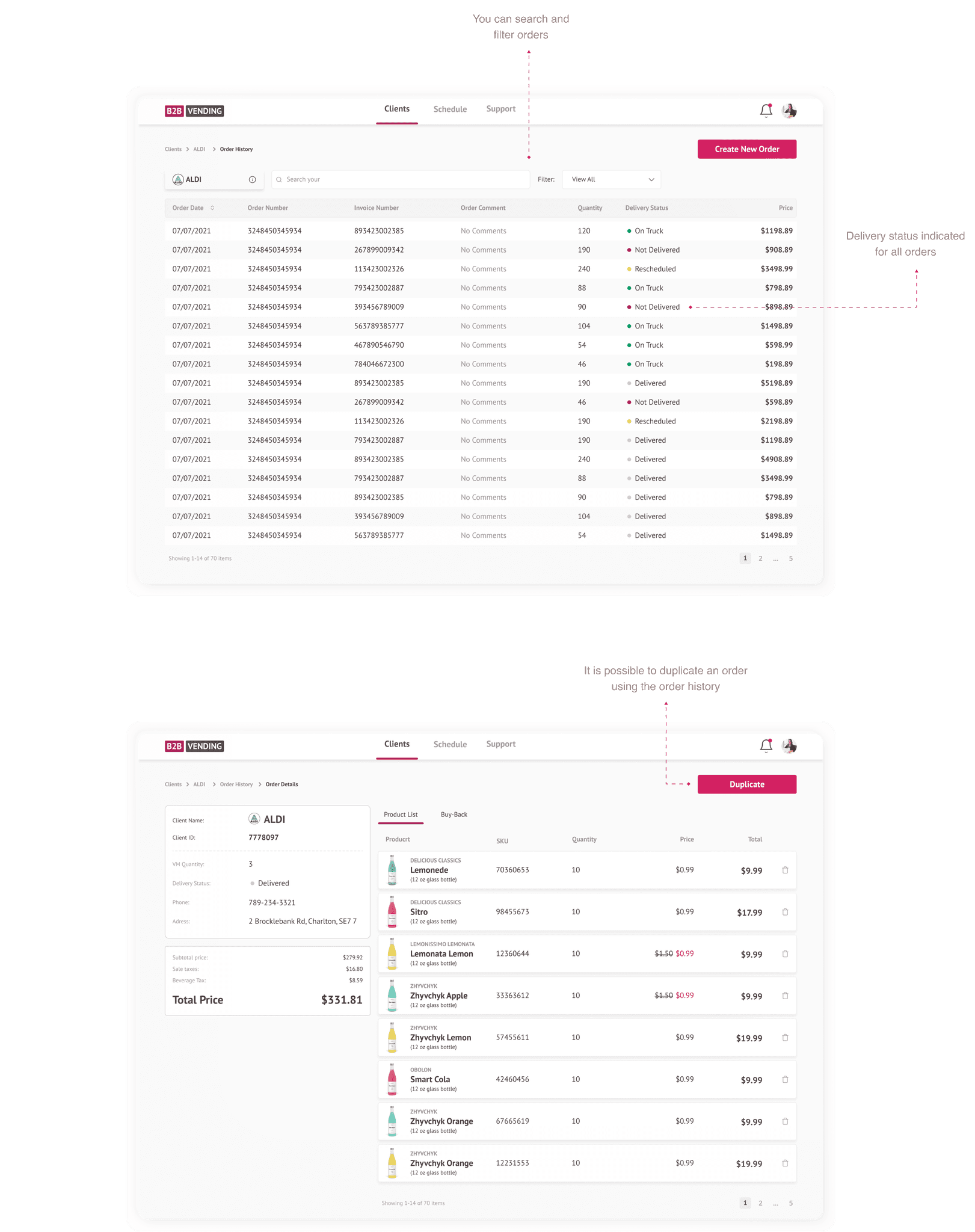
Search for customers in your notebook who need to place an order
Problems:
Check information about customers in notes, address books
Order confirmation
Problems:
Problems:


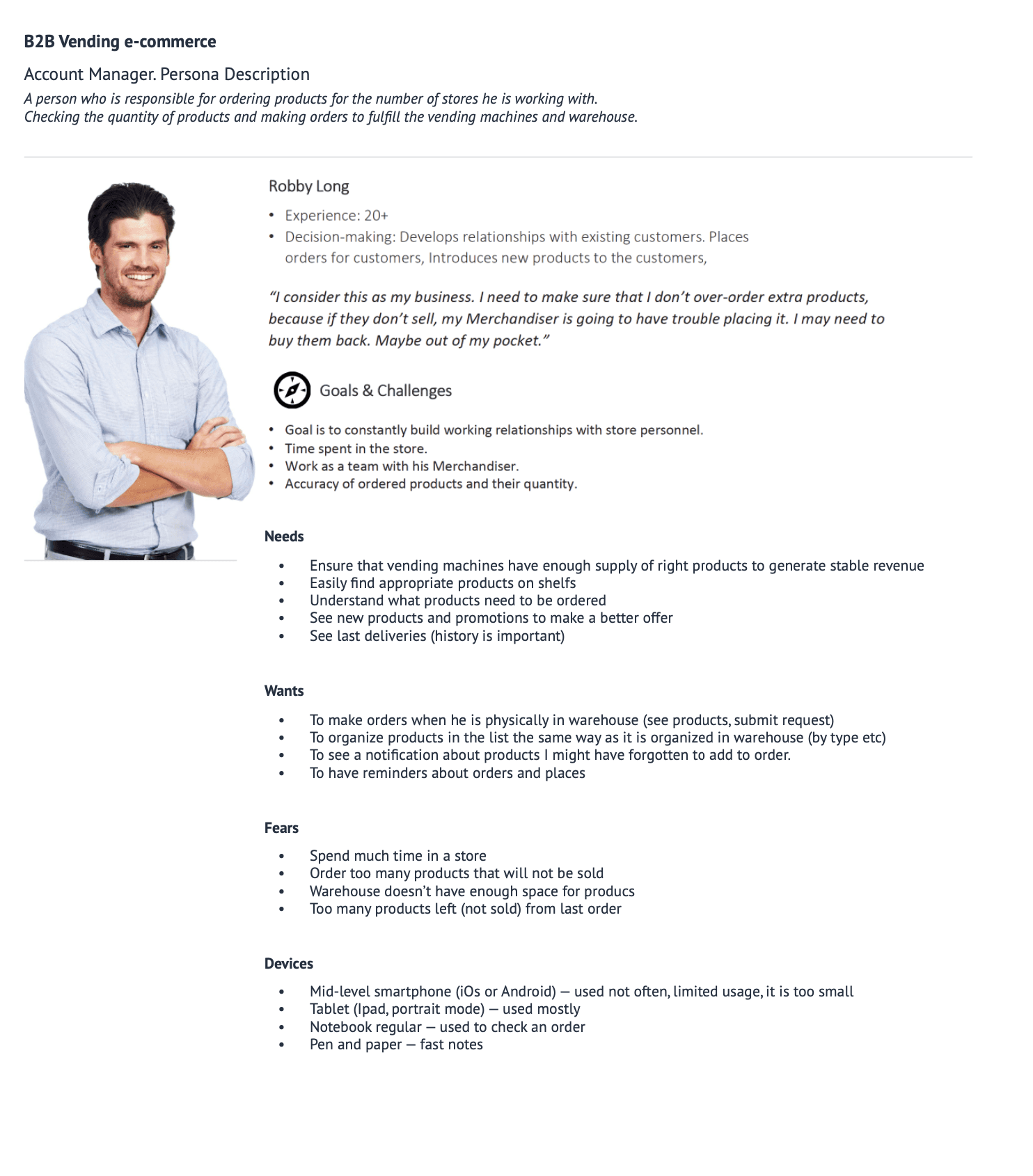
Digital tool for manager to speed up his work

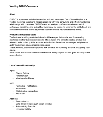
Company supplies hot and cold beverages via vending machines, partnering with retailers, cafés, and convenience stores. Field sales managers support these partners by restocking products, placing orders, and promoting new items during on-site visits.
Today, this process is manual; managers rely on notepads, address books, and phone calls to take orders. It’s slow, error-prone, and hard to track.
Business context


Smarter Sales. Fresher Drinks.
Improve product stickiness by making dashboards more actionable
Increase feature adoption (heatmaps, comparisons, exports)
Support sales by showcasing clearer, cleaner data storytelling in demos
*This phase clarified gaps between what the system provided vs. what users actually needed. It also exposed redundant fields and confusing labels, which later guided simplification and UI clarity.
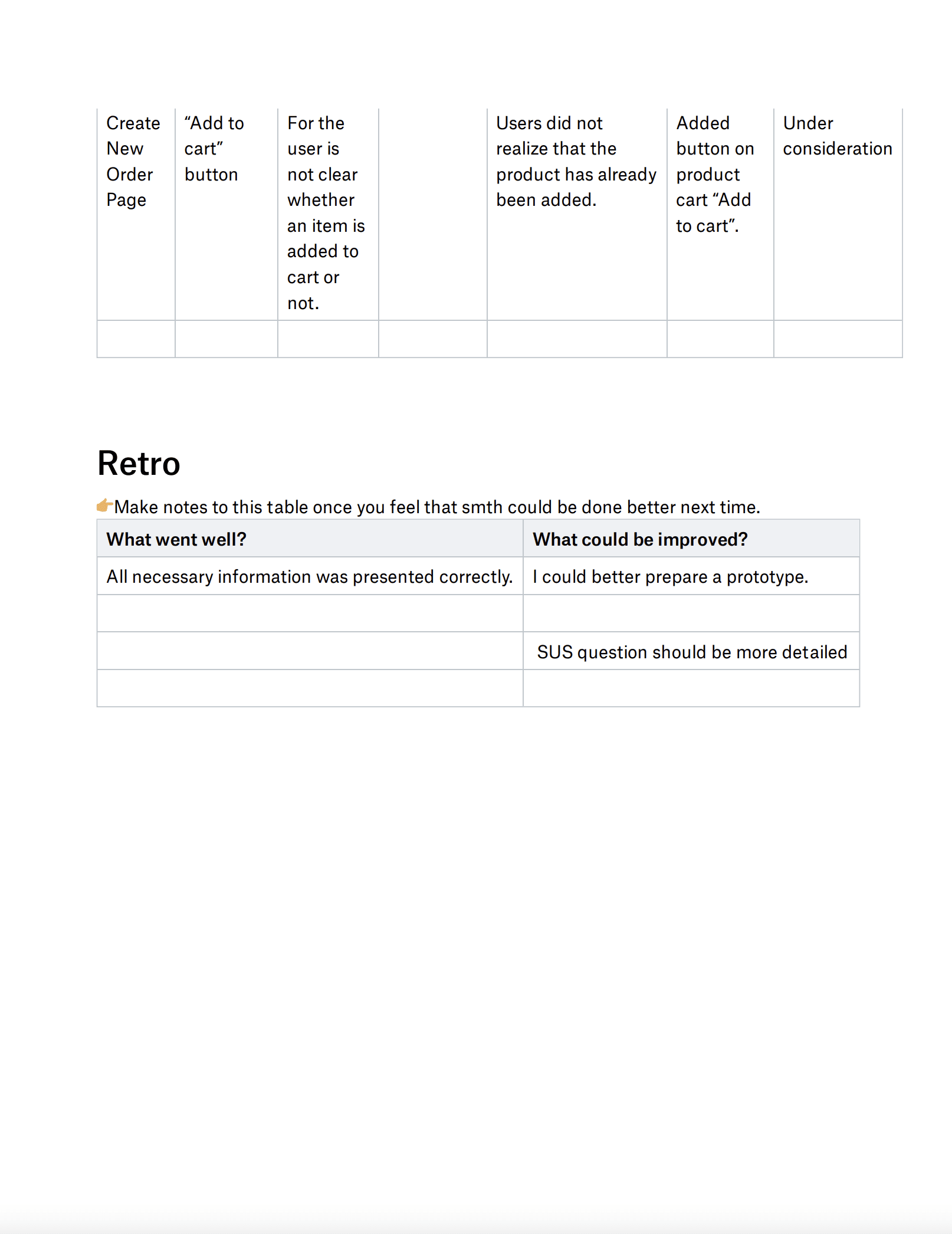
This project highlighted the importance of balancing detail and simplicity in data-heavy interfaces. Small changes like clearer labels and smarter grouping had a big impact on usability. If I were to revisit it, I’d integrate real data APIs for more realistic prototyping and conduct longitudinal testing to validate long-term effectiveness.

Reflection

Manual ordering via Excel and phone calls: Orders are created in Excel or similar tools and submitted by phone, leading to inefficiencies and higher chances of errors.
Lack of product details: Key information such as SKU, brand, type, and packaging is often missing, making it difficult to make accurate selections.
Time-consuming order creation: The absence of structured tools and automation results in a slow and tedious ordering process.
No visibility into discounts or promotions: Users are unaware of active deals, which can lead to missed opportunities and reduced order value.
Creating a new order using email and phone calls
Problems:

Project goal
Frequent need to contact customer representatives: Users often have to reach out manually to clarify missing or unclear information, adding friction to the workflow.
Time-consuming searches: Users spend unnecessary time looking for client details, product info, or past interactions.
Risk of losing important data: With no centralized or backed-up system, there’s a high chance of losing critical order or customer information.


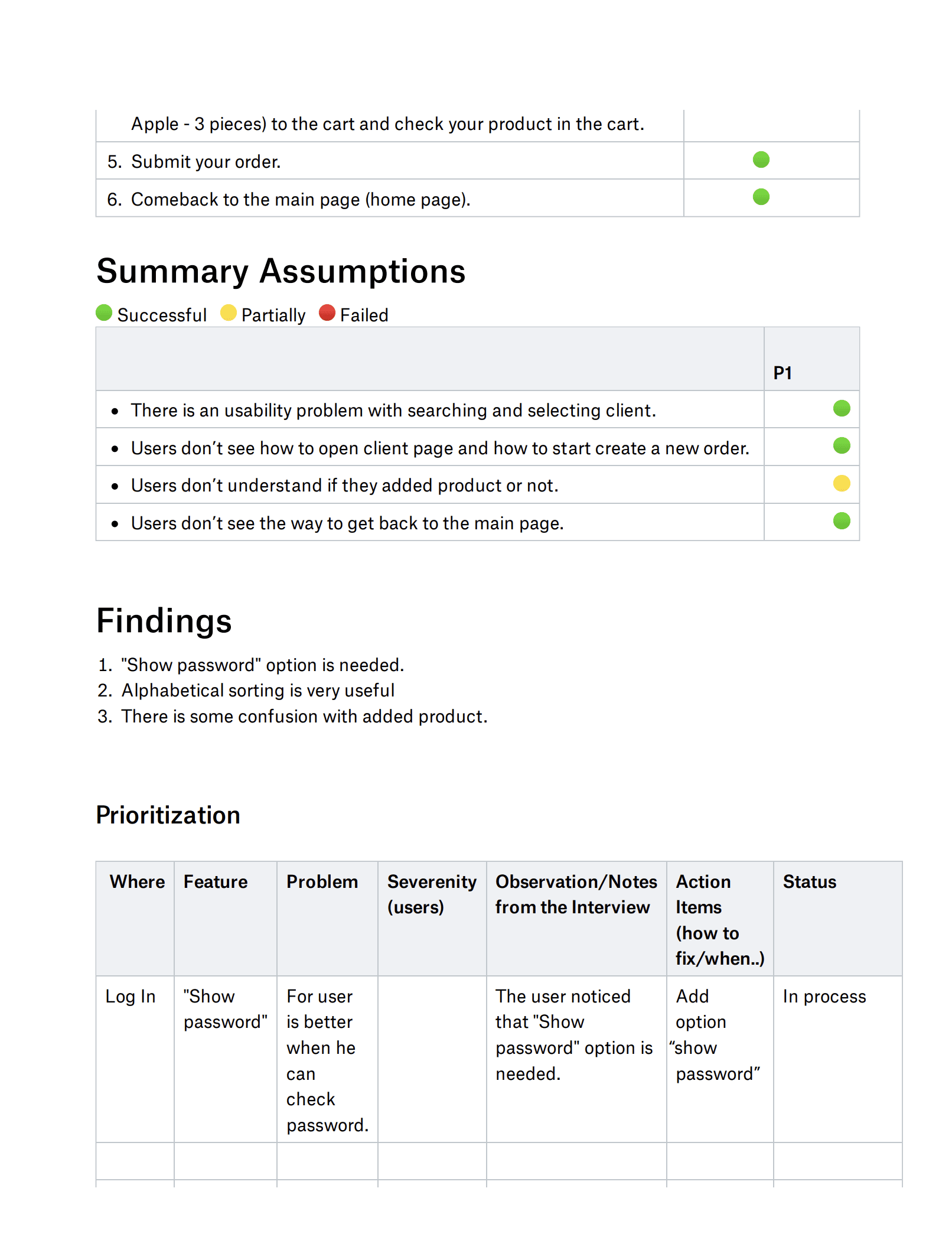
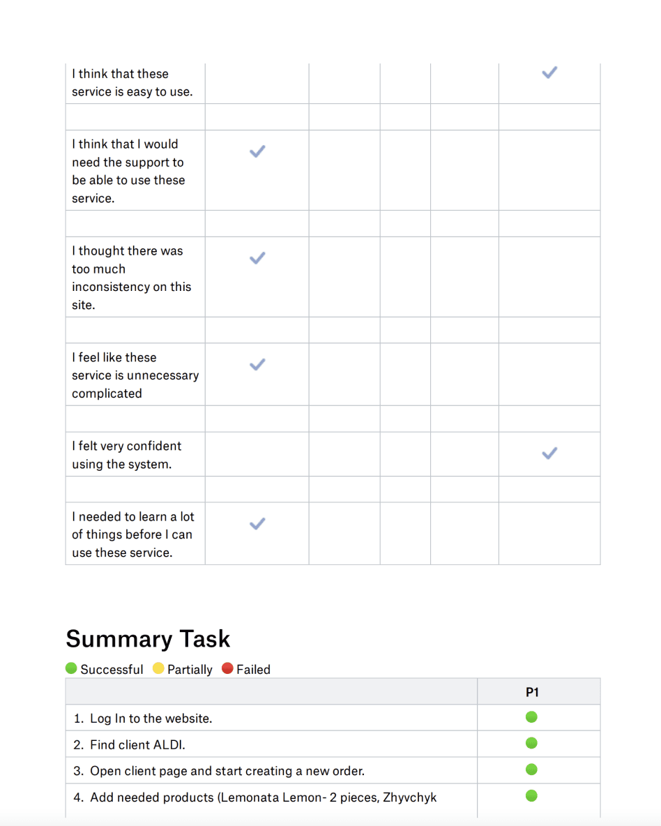
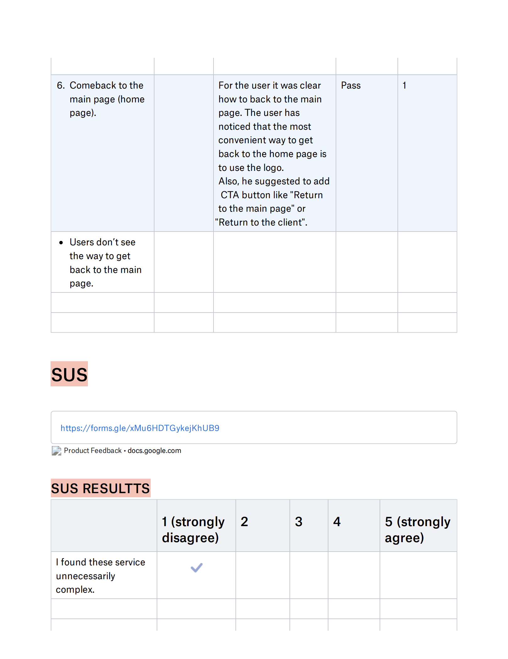
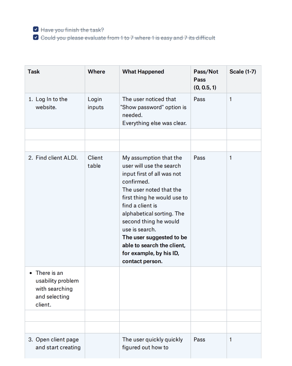
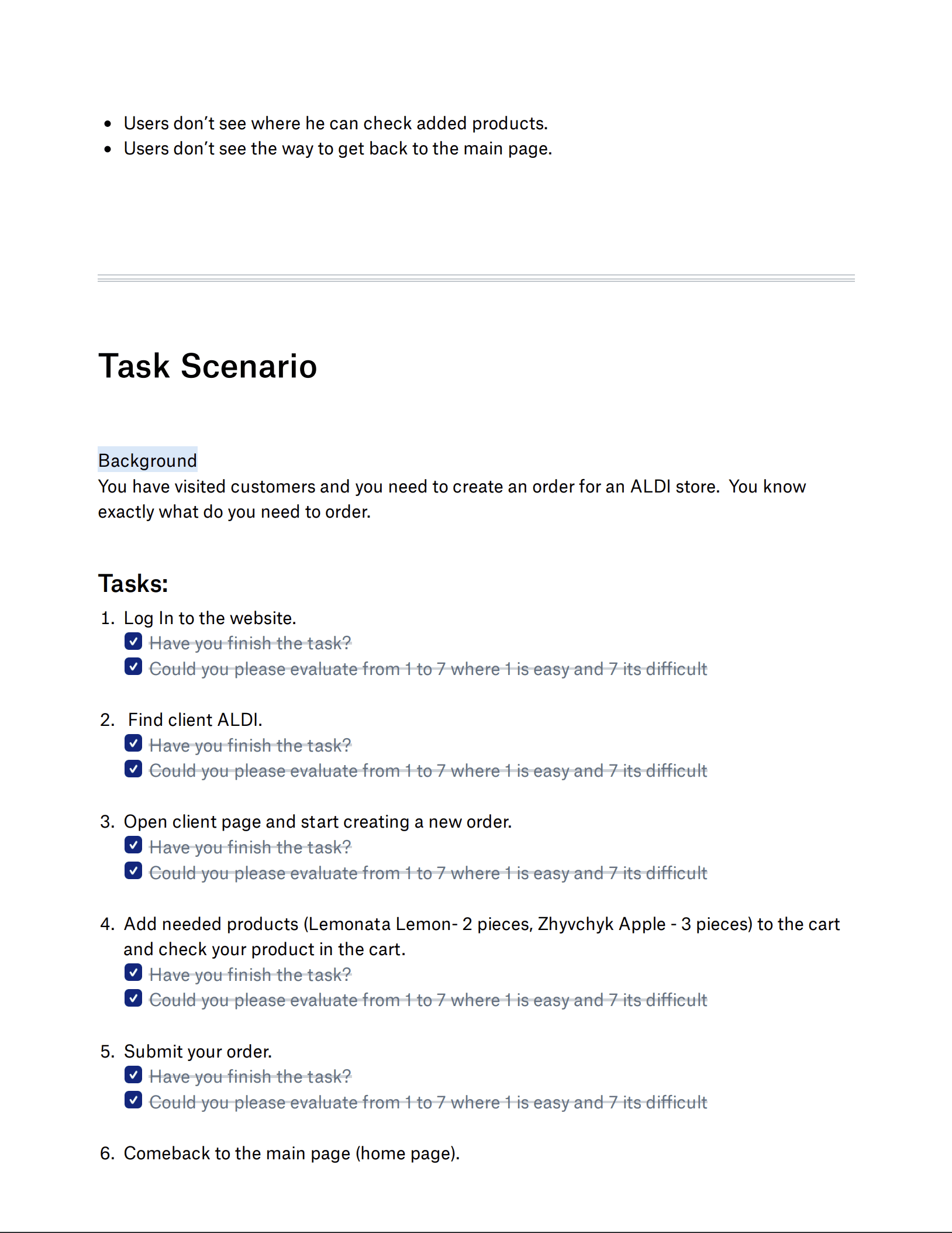
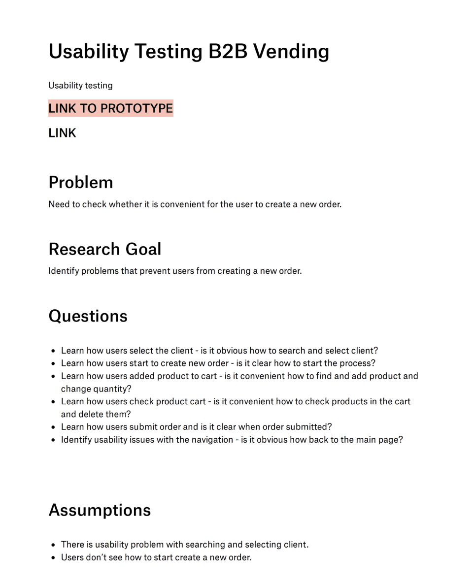
Usability testing on users
Tested the flow on the user, prepared a report, and created a list of changes required by the project based on the information received.

Documentation analysis
Key actions
Usability check
Design System
Wireframes
Approaches & Process
SOLUTION
No order history: Users can’t view or reference past orders, making it difficult to reorder, track customer behavior, or resolve discrepancies.
Insufficient client information: Limited access to customer data prevents personalized service and informed decision-making during visits.
Inaccurate product quantities due to manual entry errors
Uncertainty about order submission users aren’t sure if the order was successfully sent
Missing items in orders caused by oversight or lack of confirmation
Incorrect receipt details such as pricing, totals, or product names
There is all the necessary information about the product
Ability to edit and order before confirmation
To lay a solid foundation for the project, I began by gathering and organizing all relevant documentation. This included understanding the key metrics and KPIs valued by stakeholders, analyzing existing data reporting workflows, mapping out user roles and access levels, and compiling current pain points along with feature requests. This comprehensive review ensured that the design decisions would be grounded in real user needs and business objectives.
Prioritized simplicity for fast order input
We chose a single-screen layout with pre-filled fields based on past orders, rather than a multi-step flow. This reduced average input time by ~30%.
Offline-first architecture
Connectivity in the field was unreliable. I worked closely with engineers to ensure the app cached key data locally, syncing automatically when reconnected.
Designed for both web and tablet
The sales team used various devices. I created responsive layouts with tap-friendly UI, large buttons, and minimized data entry.
I used heuristic analysis and cognitive walkthroughs to evaluate whether my design ideas aligned with usability best practices and supported users in completing key tasks effectively.
Implemented scalable, reusable components using auto layout, improving design consistency and reducing update time across the product.
I began with sketches to explore layout ideas, then moved to mid-fidelity wireframes for testing. The design focused on clarity, easy access to actions like filtering and exporting, and strategic use of color to highlight performance.
Mockups & Prototyping
Created pixel-perfect mockups using real user data and translated them into interactive prototypes in Figma. This allowed for early usability testing, which surfaced key friction points and reduced design iteration time.
Search for customers in your notebook who need to place an order
Problems:
Check information about customers in notes, address books
Order confirmation
Problems:
Problems:
Digital tool for manager to speed up his work
Company supplies hot and cold beverages via vending machines, partnering with retailers, cafés, and convenience stores. Field sales managers support these partners by restocking products, placing orders, and promoting new items during on-site visits.
Today, this process is manual; managers rely on notepads, address books, and phone calls to take orders. It’s slow, error-prone, and hard to track.
Business context
Improve product stickiness by making dashboards more actionable
Increase feature adoption (heatmaps, comparisons, exports)
Support sales by showcasing clearer, cleaner data storytelling in demos
*This phase clarified gaps between what the system provided vs. what users actually needed. It also exposed redundant fields and confusing labels, which later guided simplification and UI clarity.
This project highlighted the importance of balancing detail and simplicity in data-heavy interfaces. Small changes like clearer labels and smarter grouping had a big impact on usability. If I were to revisit it, I’d integrate real data APIs for more realistic prototyping and conduct longitudinal testing to validate long-term effectiveness.
Reflection
Usability testing on users
Tested the flow on the user, prepared a report, and created a list of changes required by the project based on the information received.
Manual ordering via Excel and phone calls: Orders are created in Excel or similar tools and submitted by phone, leading to inefficiencies and higher chances of errors.
Lack of product details: Key information such as SKU, brand, type, and packaging is often missing, making it difficult to make accurate selections.
Time-consuming order creation: The absence of structured tools and automation results in a slow and tedious ordering process.
No visibility into discounts or promotions: Users are unaware of active deals, which can lead to missed opportunities and reduced order value.
Creating a new order using email and phone calls
Problems:
Project goal
Frequent need to contact customer representatives: Users often have to reach out manually to clarify missing or unclear information, adding friction to the workflow.
Time-consuming searches: Users spend unnecessary time looking for client details, product info, or past interactions.
Risk of losing important data: With no centralized or backed-up system, there’s a high chance of losing critical order or customer information.
Smarter Sales. Fresher Drinks.

Digital tool for manager to speed up his work
Business context
Company supplies hot and cold beverages via vending machines, partnering with retailers, cafés, and convenience stores. Field sales managers support these partners by restocking products, placing orders, and promoting new items during on-site visits.
Today, this process is manual; managers rely on notepads, address books, and phone calls to take orders. It’s slow, error-prone, and hard to track.
Smarter Sales. Fresher Drinks.
Project goal
Design a cross-platform digital tool that enables sales managers to place orders quickly, accurately, and efficiently during customer visits, ultimately driving higher conversion rates and increasing sales for the business.
Improve product stickiness by making dashboards more actionable
Increase feature adoption (heatmaps, comparisons, exports)
Support sales by showcasing clearer, cleaner data storytelling in demos
Approaches & Process
Documentation analysis:
To lay a solid foundation for the project, I began by gathering and organizing all relevant documentation. This included understanding the key metrics and KPIs valued by stakeholders, analyzing existing data reporting workflows, mapping out user roles and access levels, and compiling current pain points along with feature requests. This comprehensive review ensured that the design decisions would be grounded in real user needs and business objectives.
Key Actions:
Prioritized simplicity for fast order input
We chose a single-screen layout with pre-filled fields based on past orders, rather than a multi-step flow. This reduced average input time by ~30%.
Offline-first architecture
Connectivity in the field was unreliable. I worked closely with engineers to ensure the app cached key data locally, syncing automatically when reconnected.
Designed for both web and tablet
The sales team used various devices. I created responsive layouts with tap-friendly UI, large buttons, and minimized data entry.
*This phase clarified gaps between what the system provided vs. what users actually needed. It also exposed redundant fields and confusing labels, which later guided simplification and UI clarity.
Wireframes
I began with sketches to explore layout ideas, then moved to mid-fidelity wireframes for testing. The design focused on clarity, easy access to actions like filtering and exporting, and strategic use of color to highlight performance.
Usability check
I used heuristic analysis and cognitive walkthroughs to evaluate whether my design ideas aligned with usability best practices and supported users in completing key tasks effectively.
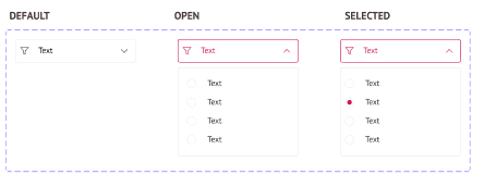
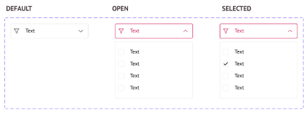
Design System
I built reusable components and variants using Auto Layout to ensure consistency, scalability, and efficient design updates across the interface.
PT SANS


Mockups & Prototyping
I created pixel-perfect mockups based on the available data and turned them into interactive prototypes to simulate real user flows and validate the design experience.
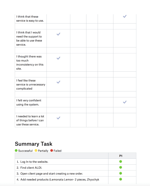
Usability testing on users
Tested the flow on the user, prepared a report, and created a list of changes required by the project based on the information received.

SOLUTION
Search for customers in your notebook who need to place an order
Problems:
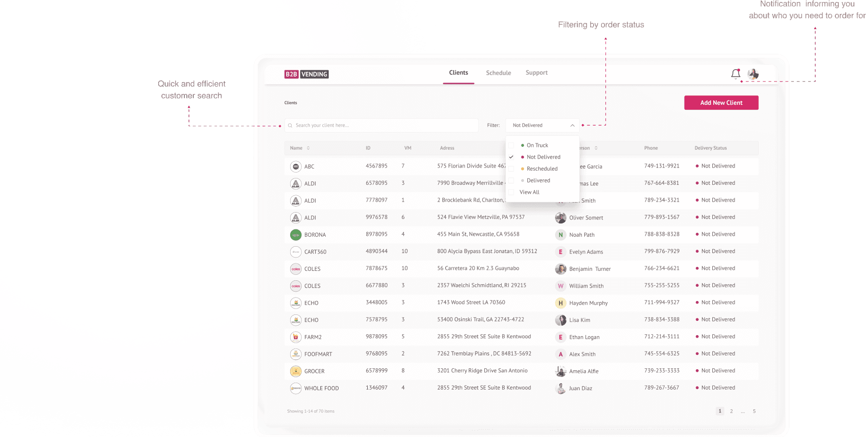
No order history: Users can’t view or reference past orders, making it difficult to reorder, track customer behavior, or resolve discrepancies.
Insufficient client information: Limited access to customer data prevents personalized service and informed decision-making during visits.
Check information about customers in notes, address books
Problems:

Creating a new order using email and phone calls
Problems:
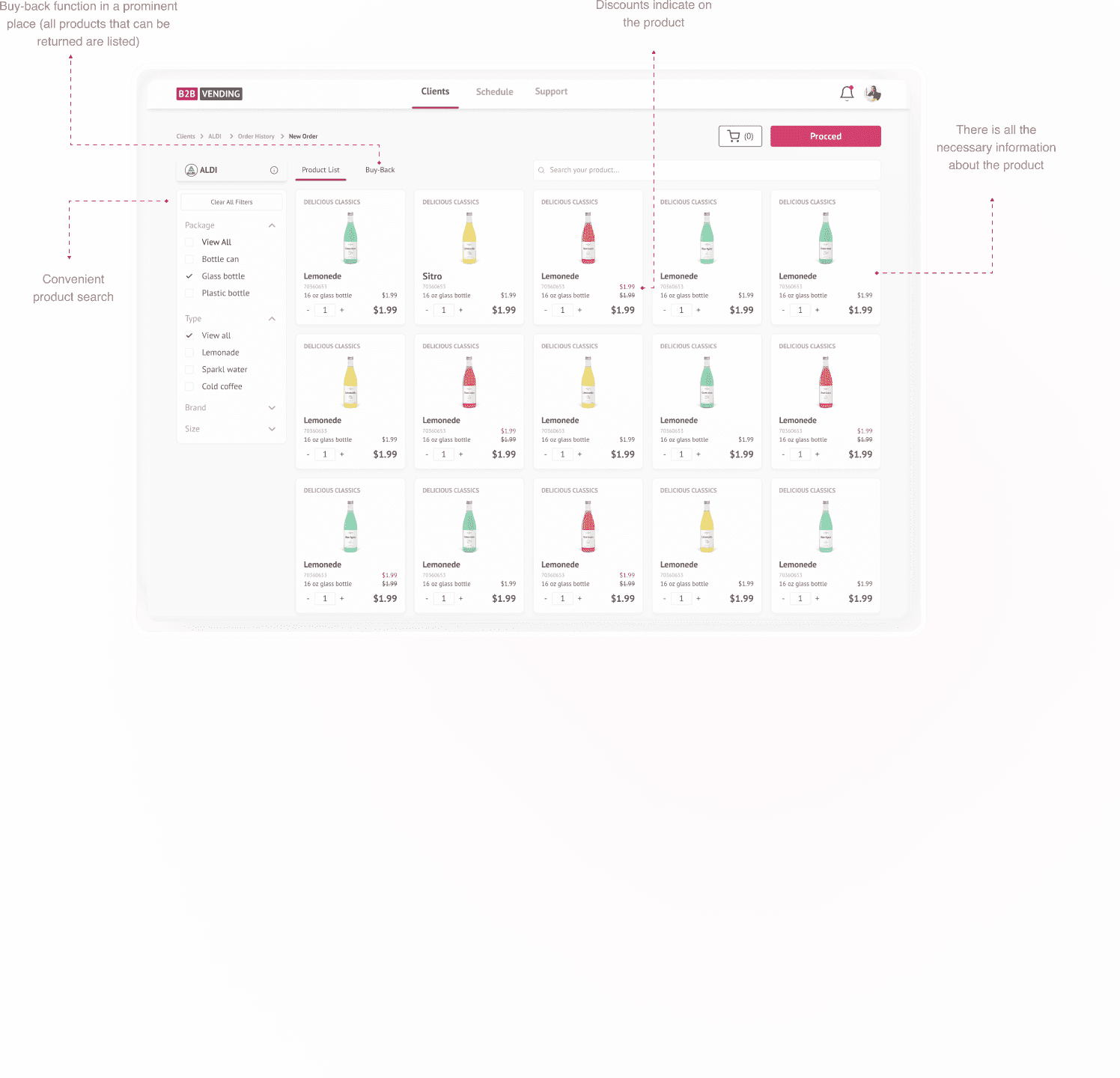
Inaccurate product quantities due to manual entry errors
Uncertainty about order submission users aren’t sure if the order was successfully sent
Missing items in orders caused by oversight or lack of confirmation
Incorrect receipt details such as pricing, totals, or product names
Order confirmation
Problems:
Reflection
This project highlighted the importance of balancing detail and simplicity in data-heavy interfaces. Small changes like clearer labels and smarter grouping had a big impact on usability. If I were to revisit it, I’d integrate real data APIs for more realistic prototyping and conduct longitudinal testing to validate long-term effectiveness.
Frequent need to contact customer representatives: Users often have to reach out manually to clarify missing or unclear information, adding friction to the workflow.
Time-consuming searches: Users spend unnecessary time looking for client details, product info, or past interactions.
Risk of losing important data: With no centralized or backed-up system, there’s a high chance of losing critical order or customer information.
Manual ordering via Excel and phone calls: Orders are created in Excel or similar tools and submitted by phone, leading to inefficiencies and higher chances of errors.
Lack of product details: Key information such as SKU, brand, type, and packaging is often missing, making it difficult to make accurate selections.
Time-consuming order creation: The absence of structured tools and automation results in a slow and tedious ordering process.
No visibility into discounts or promotions: Users are unaware of active deals, which can lead to missed opportunities and reduced order value.